Photographing Your Own Reference:
Architecture At Dusk
By Neil Blevins
Created On: June 26th 2020
Updated On: Apr 6th 2026
Software: None
This is perhaps less of a tutorial and more of a case-study. I was
presented with a problem, I found a solution, and by telling you the
story I hope that my thought process may help you out if presented in a
similar situation.
You have two choices with this lesson, watch the video below, or
read the full text.
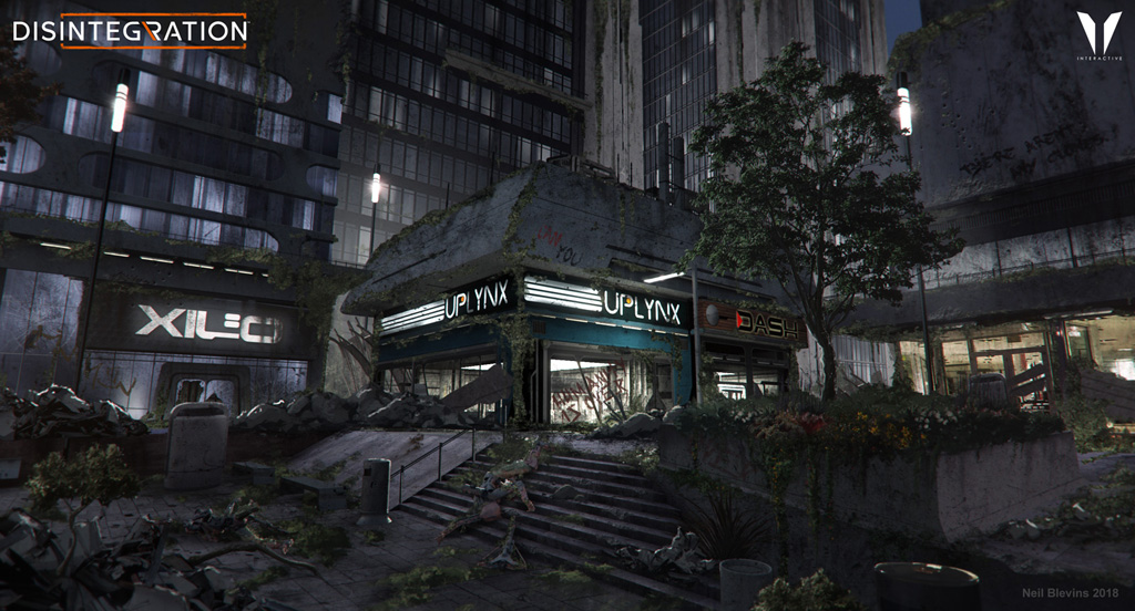
When working on the V1 Interactive game Disintegration a few
years back as a concept artist, I was presented with a design
challenge. I was asked to do a painting of a shopping mall type area at
dusk. Why is this a challenge? Two main reasons. First, the word "dusk"
I have found to be a loaded word, as everyone has a slightly different
idea in their brain of what dusk looks like. And second, the image would
combine ambient sky lighting and artificial lighting (from the shops),
and getting the right mix of these two elements was going to be a
tough. Here's a bunch of questions I felt I needed answers to in order
to move forward...
- What time of day should we set the painting, and what sort of
light does that time of day create? Is dusk late afternoon, 4pm ish,
still kinda daylight? Is dusk golden hour, where the sun is extremely
low, shadows are
long, and everything is golden colored? Is dusk where there's still
pink at the horizon, with a mid blue
above? Or where there's a deep blue above with a few stars peaking out?
- What colors are in the sky?
- What does the building material (like concrete) look like in the
lighting?
- What sorts of artificial lighting appear at night and what do
those look like?
Generally, I'll do a google image search to find reference. But in this
case, I decided that the best way to
answer all these questions would be to take my own reference. Why? Well
first because a shopping mall is easily accessible for most of us in
North America, I had one down the street. Second, I wanted to take the
same picture at multiple times of day to have a number of choices,
which is generally not easy to
find on the internet. And third, I wanted to get some highres photos,
there's
more of those on the internet now than there was 10 years ago, but my
own
photos would still be better. And last, I wanted to get out of the
house :)
Photographing Process
So that night at about 8pm, I walked out to the local shopping mall. I
brought my DSLR (Digital
single-lens reflex) camera with me and my iphone. The mall was
already
pretty deserted,
so I hoped that no one would mind me sitting down and taking a few
pictures.
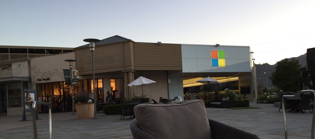
After scouting different areas of the mall, I decided to plunk myself
down in front of the microsoft store. It had a view of the sky. It had
a nice big sign that would light up as night time hit. It had a large
interior that would
light up. Basically it would have all the elements I needed for my
painting.
Next I had to decide which camera to use. Ideally, using the DSLR set
to manual would be the best choice. If I used
automatic, it would try to color correct and expose my photos to get
the "optimum" picture. It was important to not have the "optimum"
picture, instead it was more important to have a realistic photo of
what the light was doing. Having at least a basic knowledge of
photography can be a huge help when getting reference, especially if
you want to photograph things at night, since night time photography,
even for pros, is a much more difficult task than daytime photography.
After setting the DSLR it to manual, I then played
with the settings, f-stop, film speed, shutter speed,
etc, until the resulting photo looked pretty accurate to what I was
seeing with my eyes. There would be some variation of course, but
that's ok, you
want
to capture what the camera sees and not what your eye sees, since
you're trying to paint something that feels photographic.
Finally, I took a photograph every 5 minutes or so until it was dark.
Post Process
I then went home and brought the photos into photoshop. Because I
didn't use a tripod (didn't want to attract too much attention at the
mall), I had to manually crop and reposition the photos a bit to make a
series of
almost identical views. Then I set up the wedge (a wedge test is where
you do a sequence of images where you change one variable. In this
case, the variable is the lighting).
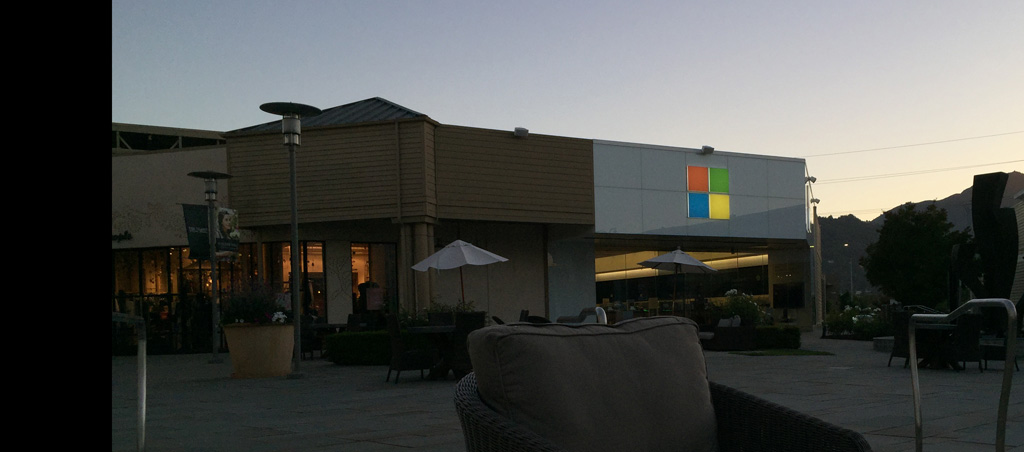
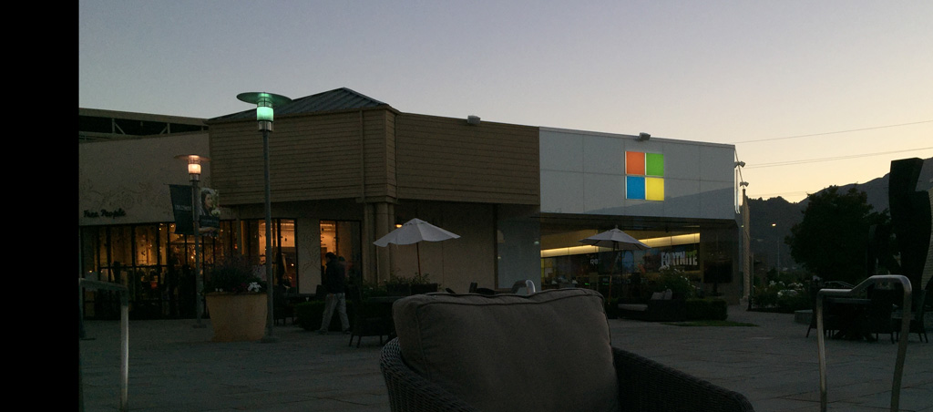
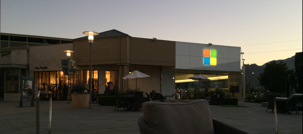
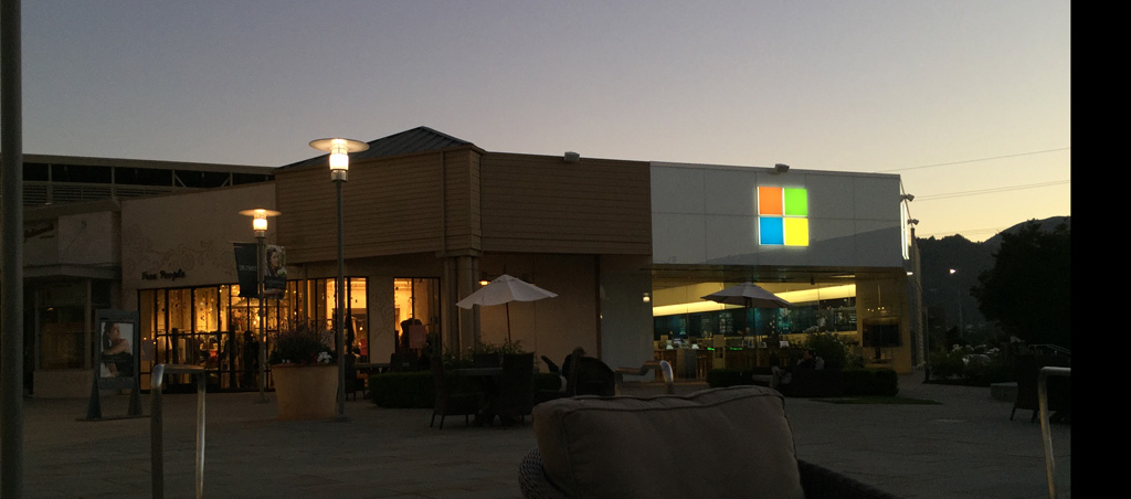
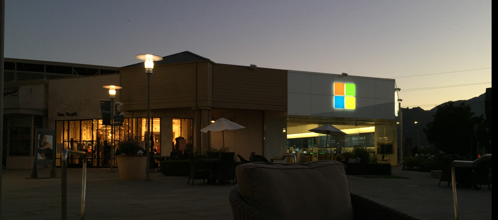
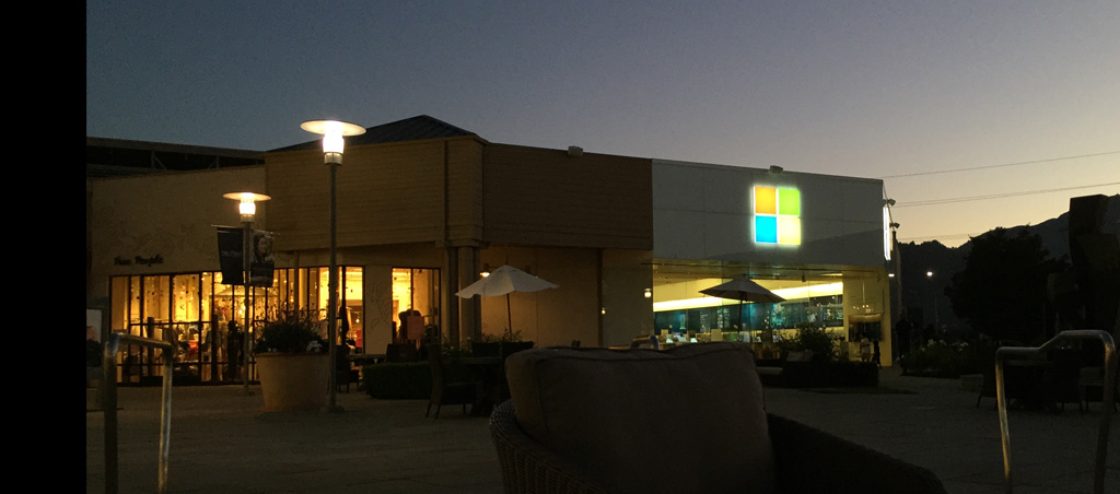
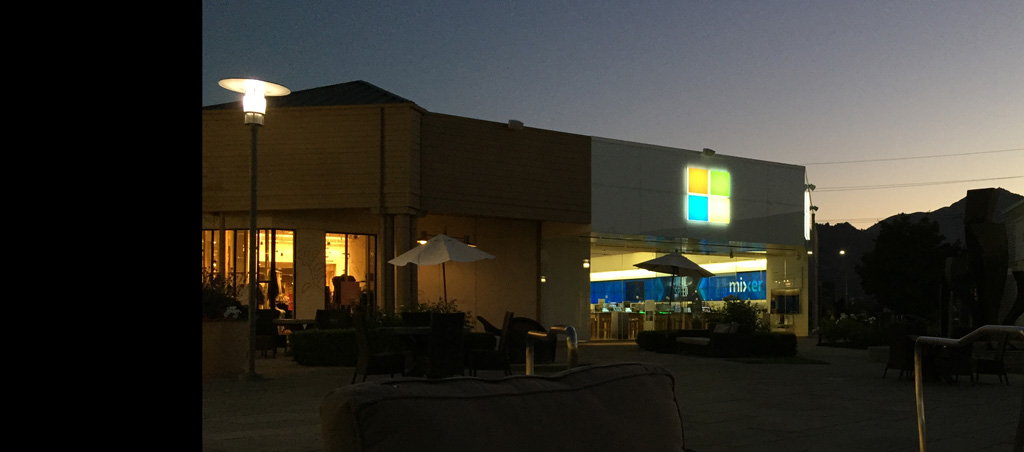
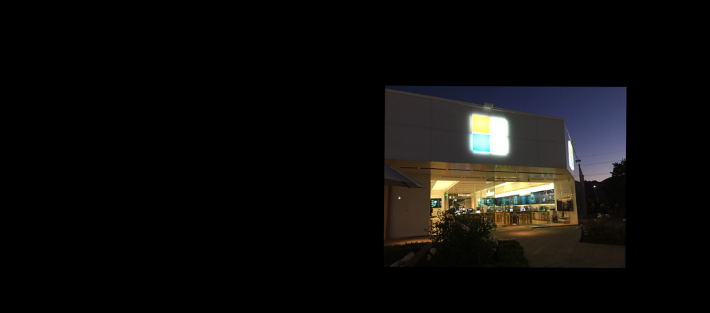
Result
Here's a contact sheet of the results:
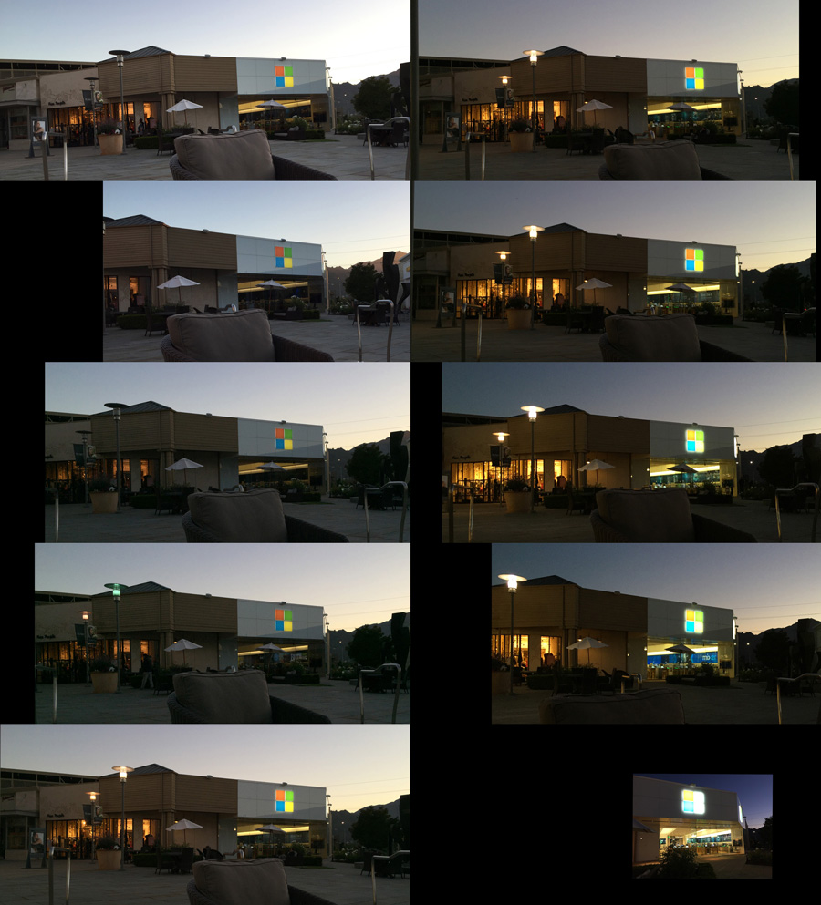
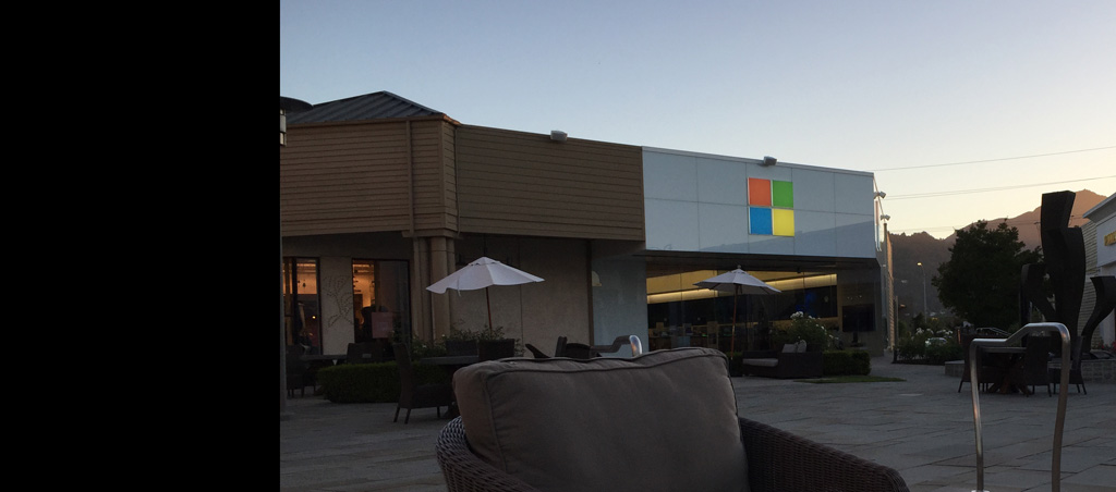
And here's higher res images of each...
Analysis
So first, I handed the client these images and said "Which dusk would
you prefer". After they chose their favorite (basically between the
last two images), I broke it down. What's
the sky gradient doing in the chosen pic? How dark should I make the
lighting in my 3d scene so that a white concrete object in the scene
looks the correct value? If I have a lamp or neon logo in my scene, how
much should it glow? And what do the insides of the shops look like?
Taking these pictures gave me a template, a good starting spot, for my
3d image, and then the subsequent painting (most of my work is done by
making a simple 3d scene and then painting over top in Photoshop).
My final painting didn't follow the reference exactly. I reduced the
amount of
glow a bit to make the signs more readable. And I increased the amount
of bounce light so the shadows weren't as dark as they were in the real
photo, so that the shadowed details were a little more readable. But
that's where artistry comes in, you shouldn't be a slave to the
photoreal (unless the goal of the project is to achieve perfect
photorealism), but the photoreal should guide your initial starting
point. In the end the painting was more stylized, but it was stylized
by choice instead of because we didn't know what the real actually
looked like. And the photos helped show me some details that I wouldn't
have had if I didn't have the reference.
Exercise
If you really want to drive the point home, here's a little exercise
you can try.
- Get a DLSR
- Practice taking photos by creating wedges. A wedge is where you
take a photo, the take the same photo with one setting changed, and
again and again.
- For example, set the camera to a shutter speed of 1/5, take
a photo, then 1/10, take a photo, keep repeating the pattern until say
1/200, then review your photos and see how the photo changes as you
change that single setting.
- Then do the same with Aperture and ISO.
Conclusion
So next time you're asked to replicate a certain lighting condition,
consider going outside, finding the real thing, and take some test
shots, then use those shots to help calibrate your final painting.
It'll help give you that extra boost of realism.
This site is ©2026 by Neil Blevins, All rights
are reserved.
To see hundreds of other tutorials similar to this one, visit the
Neil Blevins Education Site