Art Process Overview 2025
By Neil Blevins
Created On: Mar 28th 2025
Software: Any
You have two choices with this lesson, watch me discuss the issue in
the video below, or read the full text.
Whether you're doing concept art, illustration, video games,
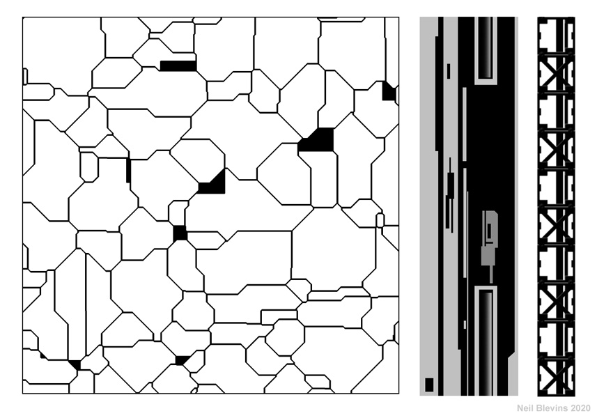
animated
films, or visual effects, we're all doing basically the same thing,
trying to create compelling imagery.
In this tutorial, I'm going to show you my own personal art workflow,
which I've refined over the years into 22 distinct stages.
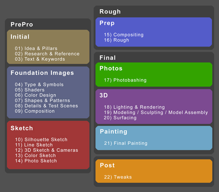
No matter what job you do, you are basically doing some subset of these
stages.
- If you are a Concept Artist
or Matte Painter who likes
incorporating 3d into your workflow, you may do all 22 stages.
- If you are a more traditional 2d Concept
Artist, you may skip stages 17-20, and focus mostly on stage 21.
- If you are a Concept Artist
but like keeping your paintings rough, you may do stages 1 to 16, and
22 only.
- If you are a Modeler in
Feature Animation, you may only do stage 19.
- If you are a Shader / Texture
Artist in Visual Effects, you may only do stage 20.
So a few other notes before moving on:
- First, I frequently skip a few stages if they're not needed for a
project, like I've
outlined 5 different types of sketches in my process, but I've never
made all 5 for a
single project, I usually only do 1 or 2 before moving on to the rough
painting.
- Also, the reason
these are called stages and not steps is because it's not unusual to do
the stages out of order, like you may do a Color Sketch (Stage 13),
then realize you need
to work on
the silhouette more, and so jump back to Stage 10 to do some more
exploration. So these stages are here to help, can be done out of
order, and some can be skipped, they're not here to define a rigid
workflow. They're here to help you succeed.
So now let's get into some more detail about each stage. As a practical
example, I'll be using the
creation process of my "Seastead" image from my Megastructure series.
Initial
The Initial stages are about the idea and gathering
reference.
1) Idea & Pillars
This is the initial idea and then the most important aspects of that
idea (also
known as the Visual Design Pillars). This can be anything from "I'm
going to make a robot"
to something more specific like "I'm going to make a robot whose
purpose is construction and he'll have really thick arms".
In the case of our Seastead example, it's "I want to illustrate a
Seastead, a city that floats
on water." I also have a general idea of the visual I want, some
buildings in the water at either dawn or dusk, sun glints in the
windows, and some low cloud cover.
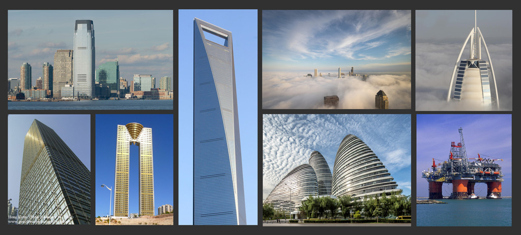
2) Research &
Reference
Next is getting good reference based on the idea. This can be other
artists work,
photos of real things, photos of completely unrelated things but that
might help support the initial idea, a photo of a material I want to
use in the image, even scientific papers. This is one of the most
important stages, and
one of the stages people most often skip from my experience. This also
helps develop your "Mental Visual Library", which is all the imagery
you've seen in your lifetime. Seeing as many images as possible and
filing them away in your brain
will always be helpful in the future, maybe that piece of reference is
imperfect for this project, but is perfect for the next. Also good is
having a physical library, whether books or a digital library of
photos, art and things you grabbed from the web. For example, my
digital library is about a terrabyte and over a million images.
For the Seastead, I collected photos of cities, buildings, cities
popping out from the clouds, oil rigs, etc.
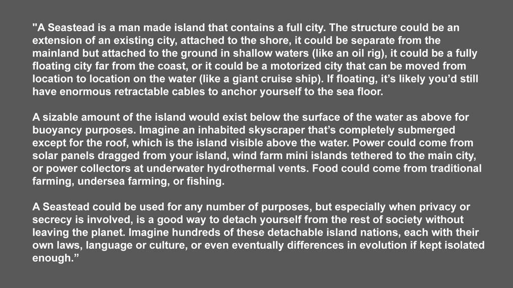
3) Text &
Keywords
Write down keywords that define your visuals. And write down a
more complex description for your concept, like writing a little back
story for your character or scenario.
For the Seastead, keywords could be things like "Mist" or "Shiny
Tower". And take a moment to read below for a detailed description of
the Seastead based on my research.
Foundation
Images
The next category is Foundation images. These are not
sketches of your final painting, these are support images that help
define details you will use in that final painting.
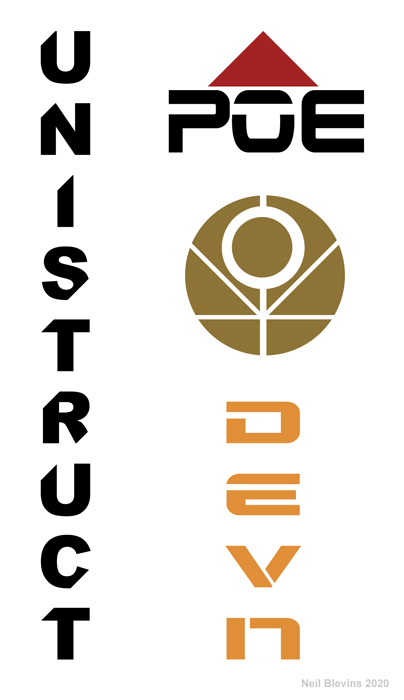
4) Type & Symbols
Will you need typography for the image? Like a company logo on the side
of a vehicle. This could be a Logo which is a word or set of words,
a Symbol which would be a picture or Combination Mark which is a
combination of a logo and
symbol. Or do you need text sitting on the image itself, like on a
movie
poster? Do you want to design your own typeface for the type? Or use a
pre-existing font? What typeface will work best for the story you're
trying to tell?
For the Seastead, since there would be commercial skyscrapers, it made
sense to have a few logos and symbols that I could slap on them to give
the city
more life.
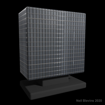
5) Shaders
Shader exploration can be photos of real materials, paintings of
materials
or shaders in a 3d program. All to show what materials may be used in
the final work, and what those materials might look like. Skin, painted
metal, starship hull plating, bark,
leaves, etc.
For the Seastead, here's an example of skyscraper window materials I
made in 3dsmax.
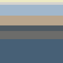
6) Color Design
What will be the main color scheme of your piece? Are there secondary
colors
you can add to make your piece more color rich? How do the colors
support the idea?
For the Seastead, I pick some colors off of the reference photos I had
to arrive at my initial color scheme.
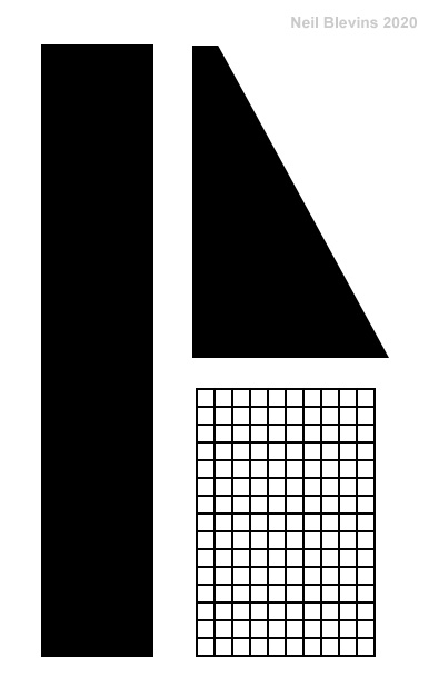
7) Shapes &
Patterns
What will the general shape language be of the objects in your image?
All circles? All
Triangles? Straight Edges? Swooping curves? If you are painting an
aggressive robot,
will spiky shapes convey that idea better than rounded curvy shapes?
Or, for example, the dwarves in the Lord Of The Rings films had the
gem as their main shape language, so in their armor, their
weapons, their architecture, you constantly see it. Once you've
decided on a shape theme, draw down some shapes that fit
that bill, then
make sure your design is made up of variations of these shapes. Will
you combine shapes into a repeating pattern? Like stripes on an animal?
Paneling on a star craft? Another good example would be say you're
doing an ancient greece based
project, if you check out greek architecture, you will constantly see
the same 2d patterns again and again (such as the "Meander", it has its
own wikipedia page: https://en.wikipedia.org/wiki/Meander_(art))
So collect these sorts of shapes and patterns for use in your final
work.
For the Seastead, I knew I was going to make a city, so the question is
what sort of city
did I want, because that choice will influence the shape language. If
you've ever seen the film "Tomorrowland", that city is an idealized
60's version of a city, its meant to be playful, and so you have lots
of spirals, loops, spheres, and other curvy shapes. Whereas most modern
cities are far more about the rectangle (the shape of the skyscraper),
and the grid (windows). Since other illustrations in the Megastructure
set would be more curvy
and fanciful, I decided to go with a "near future" look for the city.
So the most basic shapes would be the tried and true rectangle, the
grid and the triangular wedge. But since it had to look at least a
little futuristic, I made more
complex and scifi patterns for the building details.
8) Details & Test Scenes
Do you need to do any test images to try out new
techniques or new software? Are there specific details in the reference
or that you want to build separately to see what they look like before
incorporating them into the image?
For the Seastead, I considered doing 3d clouds, but decided to hand
paint
them instead to get more control. But if I had gone the 3d clouds
route, I might have gotten a copy of FumeFX for 3dsmax, and done some
test images to see if I could get the cloud look I wanted. For example,
like this cloud test made by Yuzuru Shigihara...
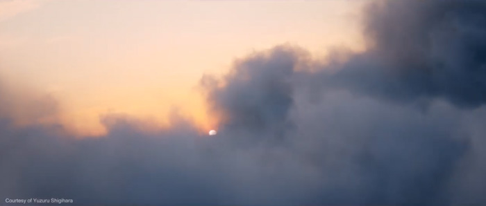
https://www.youtube.com/watch?v=6PCqU1-QdJ8
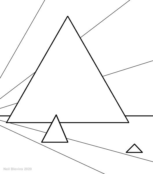
9) Composition
Now it's time to do some strong thinking on the composition of the
image. What format
will the image take? Will the
canvas be long and thin like a film frame, or square because I'm making
a CD
cover? Will the overall composition be circular? Triangular? Do I want
to use the
Golden Spiral? How much detail does the piece need and where will it be
placed?
Since the Seastead was for a book, and I had the basic page dimension,
I
chose the aspect ratio to fit the book. Then, since it was going
to be a city, cities tend to have pyramid type shapes. Smaller
buildings are in the outskirts, with taller and taller buildings until
you reach the city's core. So if you ignore the individual buildings,
and look at them as a single mass, you get a triangle shape. I decide
to place the triangle slightly off center to avoid it being too perfect.
Sketch
Now its time to make very simple versions of what your
final image will look like.
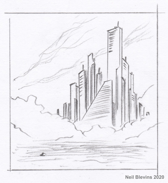
10) Silhouette
Sketch (aka Shape Sketch)
The idea with a silhouette sketch is to focus on the
edges of your object, general proportions, don't worry about detail.
Make sure your subject is instantly recognizable, even if all you see
is the silhouette.
For the Seastead, I focused on creating a set of buildings that gave
that
Pyramid feel, while still being separate buildings. And tried to decide
the proper ratio between the light background, the darker buildings,
and the water.
11) Line Sketch (aka Quick Sketch, Line
Drawing,
Initial Sketch, Diagram)
This is a line drawing of your piece. You can use pencil, pen,
digital, whatever. But you're starting to explore the forms from your
silhouette sketch a little further, including adding some simple detail.
For the Seastead, I try a little experiment and try leaning the mass
of
buildings to the right instead of the left. It looks ok, but I decide
to keep my original idea of the buildings more on the left.
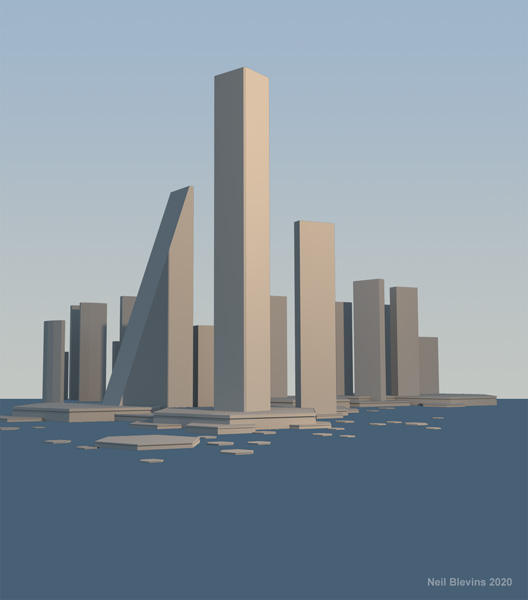
12) 3D Sketch & Cameras
To explore camera and perspective, it may be a good idea to put
together some simple shapes in a 3d program like blender, 3dsmax, maya,
or sketchup. The 3d process may suggest
other camera angles you wouldn't have thought of if you were only in
2d,
also, the final 3d sketch may be useful to paint
over later. You could also make a quick traditional 3d scene or model a
character in clay and then take a few pictures (this is something
artist James Gurney does a lot).
For the Seastead, I matched the silhouette sketch as closely as I could
in
3d. I played a lot with different lenses, to see if a wide angle or a
telephoto is better (I end up going more telephoto, which would be the
lens a real camera person in the water would use if this were a real
location). I also play with the camera being from the vantage point of
the water, or flying higher above the water. In the end, I decide to
keep the camera closer to the water ground plane, so I'm looking up at
the buildings, which give the buildings a more heroic feel. In this
case, since I had already done a few sketches, my job was to
first match the earlier sketches in 3d, and then sweeten it by playing
with the camera. But if you start with a 3d sketch before doing
any other sketch, you can use this stage to explore your set, and come
up
with a number of radically different compositions quickly. You're
likely to find some compositions that you may not have thought of by
wandering around your simple 3d "set".
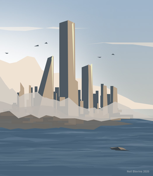
13) Color Sketch (aka Color Brief, Color Rough, Value
Sketch, Color Preliminary,
Color Thumbnail, Flat Color Sketch)
A quick painting to help place your colors. Don't add details, this is
all about general color placement. Use your Color Scheme Sketch as a
guide, or maybe you'll discover other colors are better.
For the Seastead, I colorized my 3d
sketch using colors from my Color Scheme and looking at my reference
images. Desaturated orange for the sunlit sides, blue for the shadows
and water.
 14) Photo Sketch (aka Photobashing Sketch, Photo Collage)
To avoid that blank canvas effect, you can throw together a sketch
using photos of real things as a basis to paint over. I find if I grab
a bunch of photos and throw them together in this way, it gives me a
start, it fills the canvas with something, and that gets you moving
forward more easily.
For the Seastead, I went into my reference images and I used a photo I
took of the San Francisco bay for the
water, I found a photo I had taken from downtown seattle that had those
nice sunset colored buildings, and found some appropriately colored
clouds. This sketch allowed me to get a better understanding of the
density of the windows on the buildings, and the overall color of the
lighting. Don't worry about stuff like scale or perspective, that's
something to work out later.
Prep
Now its time to go the next category, and make a rough
painting of your final image. One step beyond a sketch, one step back
from a detailed final painting.
15) Compositing (aka Initial Digital Collage, Image Assembly)
First I set up a simple composite for my image in photoshop, which can
be
made up of elements of any of your sketches. In visual effects,
compositing is usually the last part of the process. But for this sort
of work, I do it first, basically you take the simple elements you
have, setup a rough comp, and then go about replacing all of the
elements with more detailed final work. Think of it like a checklist, I
get all the pieces together, and now I need to refine each separate
piece. The reason this stage can be
referred to as Digital Collage is because you may in fact use multiple
elements, hand painted things, photos, 3d, all mixed together to arrive
at your final result. In fact, while most people refer to this sort of
work as "painting", I personally prefer the term Digital Collage since
I think it gives a better idea of what you're actually doing to create
the final imagery.
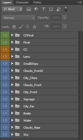
For the Seastead, I setup my basic comp with groups. My lowest group is
my sky and background clouds, then a water group, then the city groups,
and then more clouds. I
also plan on doing my final compositing in Red Giant's Magic Bullet
Looks software, which I use to add glows and vignettes and final color
correction, so I setup a basic comp in that software as well.
16) Rough (aka Rough Digital Collage, Rough Painting)
In the composite I start a rough painting to flush out the details from
my sketches. This may be the last step if I don't want to do a more
finished image. Also, what constitutes a "rough" painting is very
subjective, in my case, I classify any painting where I can very easily
see brush strokes as a rough painting.
For the Seastead, since I knew I would be doing a more detailed
painting,
I kept my rough a little rougher than I would have if this was going to
be the final product. But an image like this can be great for planning
the final painting. Or if say I was working on an animated feature, and
I was doing a lighting key for a shot, this would be enough information
to pass on to the lighting department, getting all the smaller details
in there really wouldn't be necessary.
Final
Now its time to combine photos, 3d and hand painting
to
arrive at the final image.
Photos
17) Photobashing
If I'm going to move onto a more finished piece, I use bits of
photographs to speed up the process.
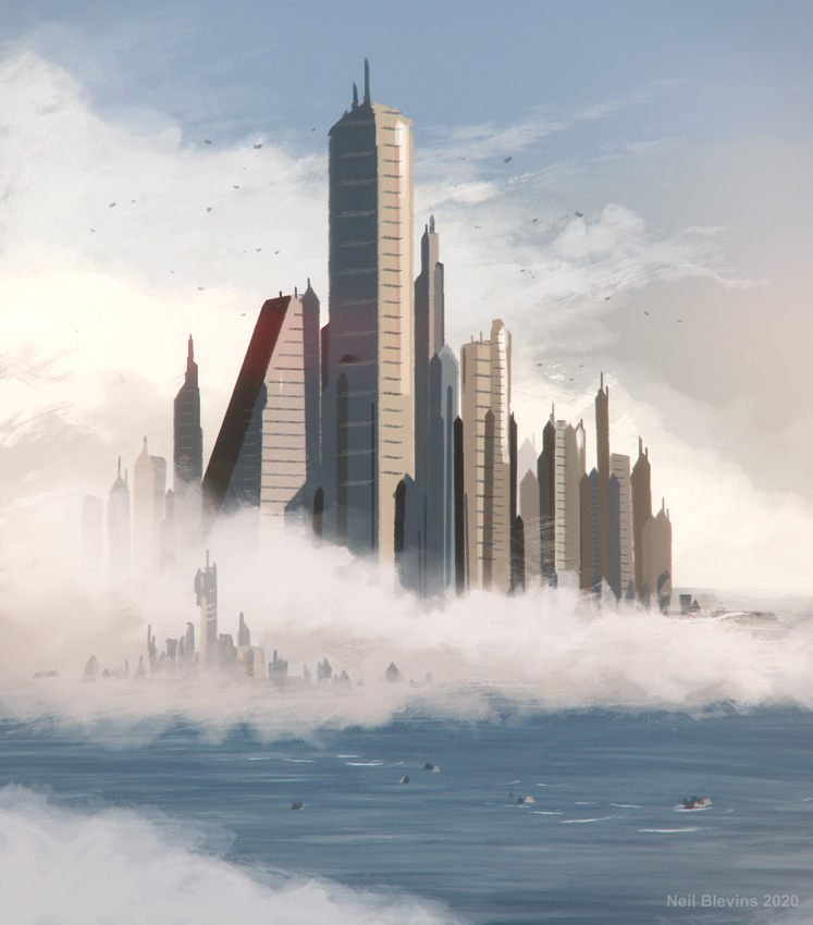
For the Seastead, I used a lot of photos for the water, some for the
clouds, and some for the buildings. Here's a bunch of photos I layered
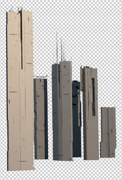
in of an oil refinery to make up the smaller buildings near the shore.
Many of these buildings would be covered up with clouds, so I didn't
worry too much about how they looked or their perspective, they were
just there to add some building details behind the cloud layer.
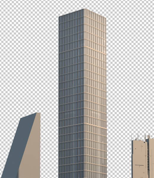
3D
18) Lighting & Rendering
I take my 3d sketch
and refine the lighting in 3d, using my Rough and/or Color
Sketch as a guide.
For the Seastead, the base lighting is pretty simple, a
directional light
for the sun and a dome light for the sky.
19) Modeling / Sculpting / Model Assembly
I then do my final modeling in 3d. Any part of my scene that will be
3d, I replace the rough 2d layers in my composite with the 3d elements.
Modeling generally refers to hard
surface modeling. Sculpting generally refers to organic sculpting maybe
using a sculpt program like mudbox or zbrush. And Model Assembly means
taking the individual modeled / sculpted pieces and sticking them
together in a pleasing final model (like placing a hundred plants in
your terrain for example).
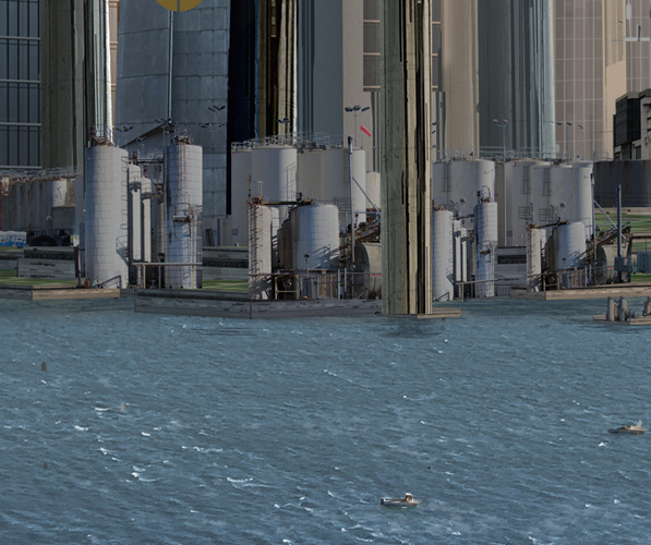
While the main hero buildings in the Seastead were going to be hand
painted, I needed
some background scifi buildings, and so used a number of building
models from Vitaly Bulgarov from his Megastructures kitbash pack: https://vitalybulgarov.com/3d-kitbash/meg
20) Surfacing (aka Shading, Texturing)
Now I add the final shading and textures to my 3d model. This may be
simple, as I may be painting on top of my final image in 2d. Or it
could be complex if I plan on keeping it mostly 3d.
For the Seastead, it was really simple to take buildings and apply a
window texture to them in 3d, this is way more time consuming to do in
2d
after the fact.
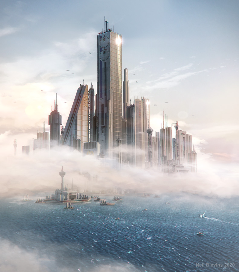
Painting
21) Final Painting (aka Final Digital
Collage)
I then take my composite, add the 3d elements that I modeled, lit and
shaded, mix with any photo elements, and then paint on top in 2d. This
painting is far more refined than
the rough, but I use the rough as a guide, and some
elements from the rough may even make their way into the
final painting. I use lots of modern matte painting techniques to
meld the 3d, photos and traditional 2d paint together. The
idea is some things are just way easier to paint in 2d then to do in
3d, some things are easier to photograph and the manipulate than to
build, so why not use the best of all worlds.
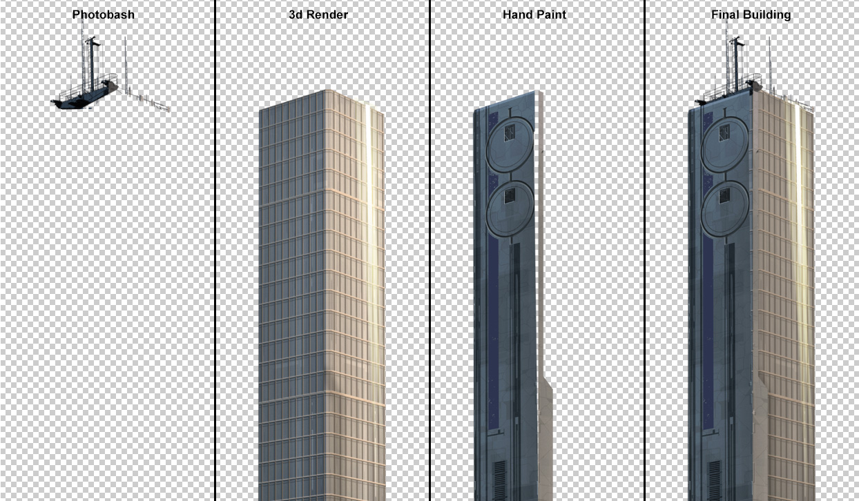
Here's showing the elements used for the main building in the Seastead.
I used photos
of real towers on top of buildings, then added my 3d render of the
windows. Then I hand painted a portion of the building in Photoshop,
the windows on the 3d render basically gave me a perspective grid to
paint the other elements. Then all 3 techniques were layered together
to give me the final building.
Post
So you think you're done? Lets do one last check.
22) Tweaks
Now it's time for the final tweaks to
all the elements. Really push the Composition,
Color, Form and Texture. Put the image away for a few days to see it
with fresh eyes. Mirror the canvas to see if you've missed something.
Compare it to your own work or the work of others to make sure it holds
up. Ask someone for
their opinion. Look at the image on a different computer or platform to
see what small tweaks need to be made (I like looking at it on my
iphone to see it in a very different way).
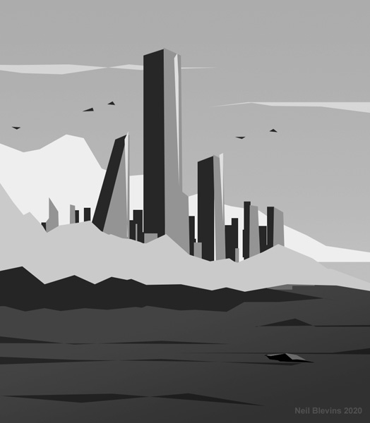
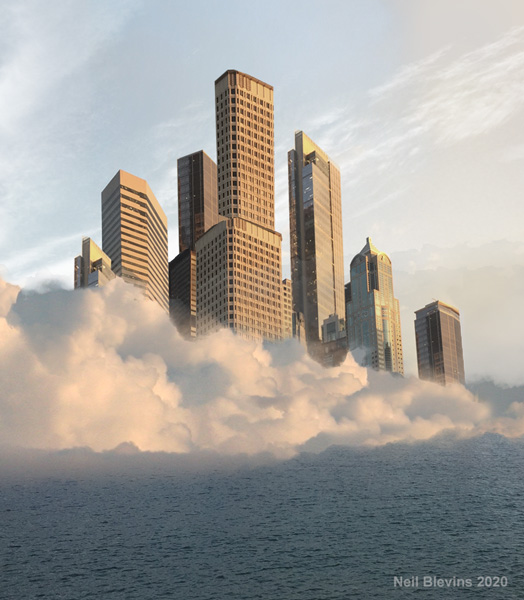
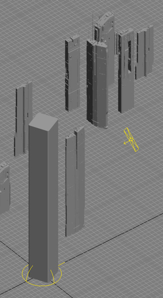
And here's the final Seastead image.
Conclusion
So now you have a little more information on
the 22 stages I use for my image making process. Obviously this is just
a short overview of the process, each stage could easily warrant a full
book on the subject. Since books take a long time to write and aren't
easily updated, I've added tutorials, both video and text, on each of
these 22 stages to my website in the "Art Making Process" section. And
I'll add more as time permits. That way I can share the information
as I have time to write or record it, rather than waiting for the
entire stage to be fully fleshed out.
So if you're interested in following along with all 22 stages, you can
read all the articles, or if you're more of a specialist, say a texture
artist, then you can read just the tutorials in the Shading and
Texturing stage. I tried to make the material on the Education page
as useful as possible to the widest audience possible, from specialists
to generalists, concept
artists, matte painters, modelers, and
shading / texturing artists, and whether you're doing vfx,
animated films
or videogames or something else entirely. I've also tried to write as
many tutorials as possible that don't require knowledge of any specific
software.
So there you go, please go explore my Education
Page, and hope you find something in there that's useful
in your own work.
This site is ©2026 by Neil Blevins, All rights
are reserved.
To see hundreds of other tutorials similar to this one, visit the
Neil Blevins Education Site