Color As It Relates To Culture
And Emotion
By Neil Blevins
Created On: Sept 16th 2024
Updated On: Oct 29th 2025
A color scheme is a color or set of colors that will appear again
and again in a painting, film sequence, group of characters, or
videogame 3d
world. It can be used to create
coherency, as a way to identify things that relate to each other, and
can be a part of a visual hook.
There are many ways to choose a color scheme:
- Based on Color Theory models (Complimentary colors, analogous
colors, etc)
- The optical response of the human eye
- Natural colors based purely on the local color of real world
objects
But another way to choose a color scheme is to understand that
certain colors and combinations can trigger specific emotional
responses, and so you try and chose the colors that will give you the
emotional state you want from your viewer. The problem is that the
associations or emotions certain
colors communicate can vary depending on culture. This applies to far
more than just color schemes, it can apply to architecture, shapes,
clothing and any number of other aesthetic choices, but color is
frequently attached to emotion in color theory books, so it's
especially important to consider when designing your color scheme.
While an enormous subject of research, this tutorial tries to give
you a few pointers on choosing colors based on their emotional impact,
and how that changes based on factors such as culture.
Colors by Association
When creating a color scheme, the hope is to relate the colors
you've chosen to something that means something to the audience. This
can be something simple like direct visual association, like these 3
colors...

What do you think of when you see these colors?
Maybe Sushi? Maybe a formal
business suit?

Therefor these 3 colors might communicate to you or the audience the
ideas of sophistication, classiness and power.

What do you think of when you see these colors?
Maybe Sully from Monsters Inc?
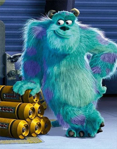
Disney / Pixar
Therefor these 2 colors might communicate to you or the audience the
ideas of playfulness or lovability.
But these sorts of associations can go deeper, and colors can
trigger certain emotions based on less specific associations. This is a
worthy goal to achieve, but you also need to keep in mind that these
associations may be very different depending on the culture of your
intended audience.
Colors / Emotion / Culture
While there are many exceptions to these rules, there are some large
scale generalities that can be said about the association certain
colors have as they relate to emotion and culture.
It’s important to understand these are generalities, not hard and fast
rules. No set of rules can define an entire culture. Plus cultures
evolve over time, so take these all with a grain of salt.
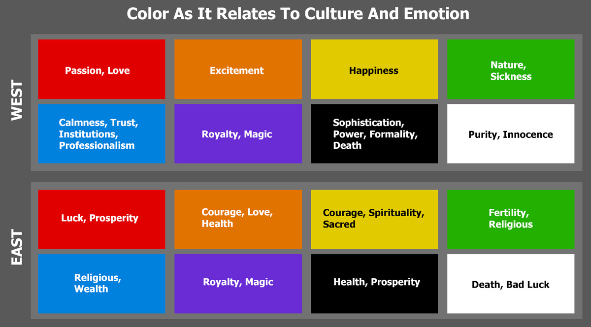
Here's a few colors and their associations based generally on a Western
/ Eastern Culture split.
Deep Dive
Now lets discuss some specific examples where colors and color
schemes relate to emotions and culture.
Red is a very common used color in Asia, which makes sense because it's
more
commonly associated with luck and prosperity in the east. Red is also a
color where it's meaning is generally positive in all world cultures.

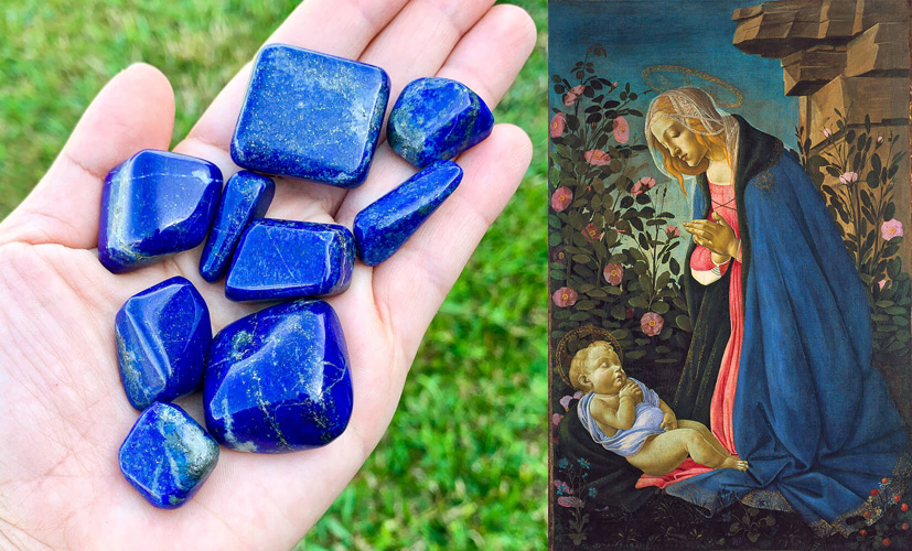
A few notes about Blue. To get the saturated blue color in paintings
1000 years ago required
a semi precious stone called "Lapis
Lazuli". Since this was expensive to buy, it tended to be used for the
most important part of the painting, which is why it was commonly used
for the clothing of the Virgin Mary in religious paintings. This may be
one reason the color blue in western culture is connected with trust
and professionalism, as it signified trust in god and the church.
Purple pigment was also expensive, another reason purple is associated
with royalty.
In the United States, before the 1940s, pink was a male color, and blue
was feminine. This is because blue was considered calm and pink was
considered strong and passionate, playing into the gender stereotypes.
After the 1940s, pink became a female color, and blue the male color.
While there's no definitive answer as to why, some speculate
it was an effort to reestablish traditional Western gender roles. After
World War 2, women
were being pushed out of the workforce and back into the home, and so
hot pink was used to make them more flamboyant and non serious, and
blue was more neutral, which
reflected the seriousness of uniforms of male military officers after
years of war.

Blue can be considered a feminine color in china, with black for boys.
So remember, as well as culture affecting color association, time is
also a factor, different colors mean different things to different people in different eras.
Green is the traditional color of Islam and is associated with
paradise. The color green is associated with Islam because it is
believed to have been the Prophet Muhammad's favorite color.
As a practical example of using green in the West to represent Nature,
in my book "The Story Of Inc", the color green was rarely used since
the book took place in the desert. The only time green was used was to
show a story point that the Citadel could produce plants and food that
were not available to the desert folk.
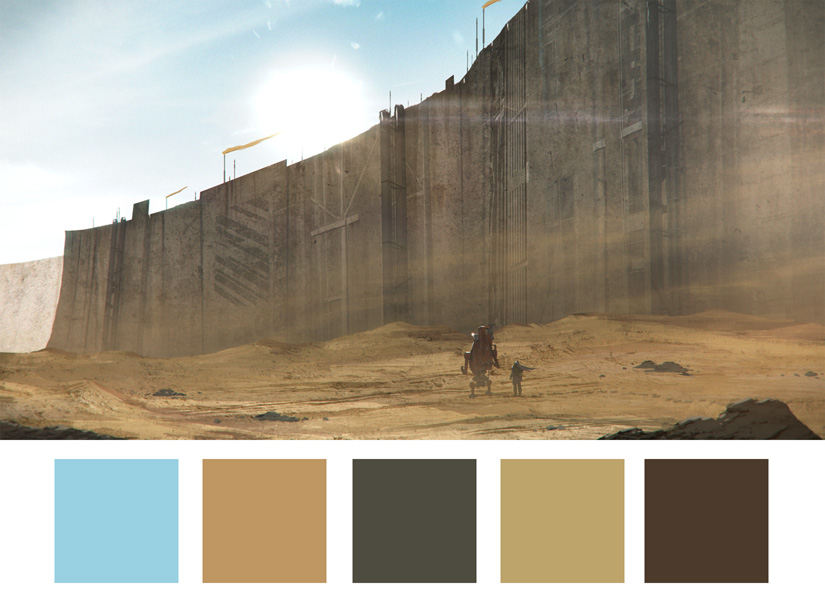

I got this trick from the film Wall-e from Pixar, with the
destroyed earth being all browns and the only green was the plant
Wall-e finds and gives to Eve.
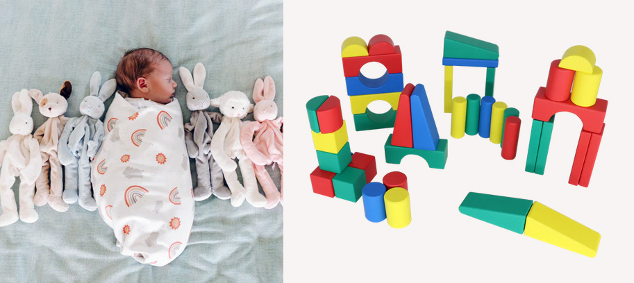
Pastels (desaturated colors) are frequently used for babies as a
calming effect (please stop crying!!), but once the kids are a little
older and starting to play with toys, you're more likely to use
saturated primary colors to attract them to manipulate the objects and
learn. Something to consider if making a property for babies or kids.
Every shot in a Pixar film is just filled with
artistic choices that
are meant to enhance the story, and many of those relate to color. In
the beginning of the Incredibles, young Mr
Incredible is at the top of his game, the prime of his life, and
everything
is going awesome.
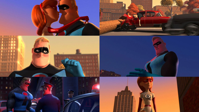
Copyright Pixar / Disney
Then here's a
shot of
Bob no longer doing hero work, he now works at an insurance company and
all the joy has left his life.

Copyright Pixar /
Disney
Notice how the
colors in
the first image sequence are strong, saturated and striking. And the
second image is
basically monochromatic, dull and lifeless. This isn't by accident. The
colors used in
these two sequences are designed specifically to enhance the story
point. Bob's
life used to be awesome (colorful), and now it sucks (bland).
In fact, every Pixar film has what's called a Color Script, which is a
set of semi abstract color paintings called "Pastels", because they
used to be made in pastel before moved to digital, that represent the
colors across the film, the emotional highs and lows. These color
scripts are then used by the lighting deptartment to make sure the
colors are consistent and match the mood of a particular scene.

Copyright Pixar /
Disney: Artist Ralph Eggelston
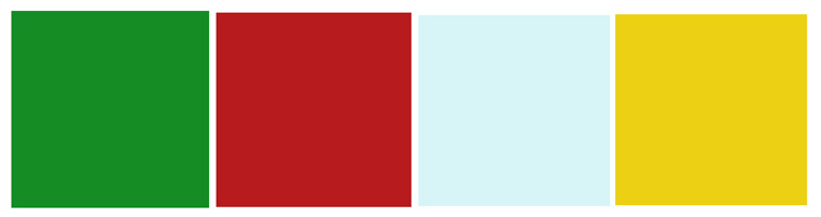
Certain colors can also be matched to holiday seasons. These are
heavily based on culture, but are a great shortcut to trigger people's
associations if you have a narrower target audience. For example, if
you want a piece to feel like christams time, maybe this color scheme
will give them that impression:
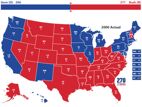
In the United States Of America, there are 2 major political parties,
the Democrats and The Republicans. The color associated with the
Democrats is blue who are more liberal, and red for the Republicans who
are more conservative. But in general, Blue is considered a
conservative color, representing calmness and professionalism. So why
are these colors swapped in the American political system?
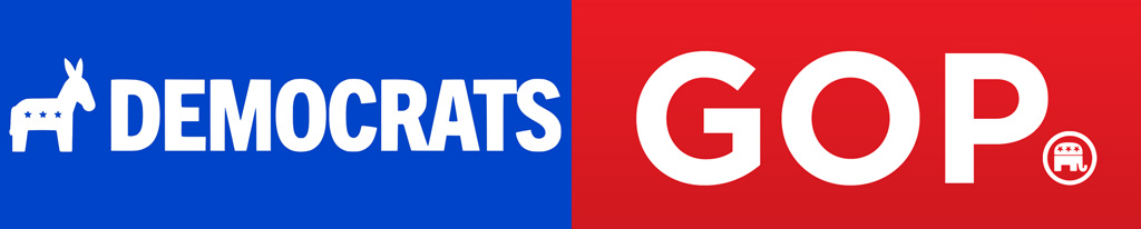
Prior to the 2000s, the colors are more what you'd expect, red for
liberal and blue for conservative, which was more akin to the colors
denoting the british political parties. The same with the Canadian
political parties, blue was and still is conservative, and red is
liberal.

But in the 2000s in the USA, the story goes that it was the first time
an electoral map was shown on television, which used red for
republicans and blue for democrats, and the system stuck after that. So
why those colors? Nothing more than the choice of the graphics editor
that Republican starts with "R" and so let's make them Red.
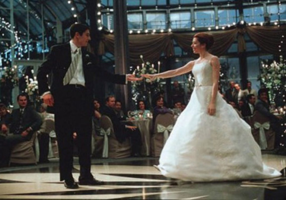
And finally one of the more famous examples of how culture can affect
color choice. In the East the color white is reserved for Death, and so
you'd never wear white to a wedding in the east. Instead Red is more
likely to be chosen as the color of a wedding dress (Luck and
Prosperity). In the west, white is more about purity, so a bride's
wedding dress is more traditionally to be white.
Conclusion
To use colors effectively to trigger emotions and associations,
remember these two important points:
- Who is your Target Audience? We learned about how different
groups can have different color associations, so deciding on your
target audience can let you make better choices. For example, if you're
making a film
that you expect will only be seen in North America, there are certain
color schemes that are fine. But that same color scheme may mean
something very different in other countries. The same for different age
groups. So decide who is the audience is for what you're making, that
will help inform your color choice.
- Coherency: Whatever scheme you do choose, use it consistently. If
a bunch of characters in a film always wear red, people will naturally
associate those characters together, forming a group in their mind. Be
aware of this and use colors consistently to trigger this phenomenon
and avoid the grouping effect when you don't want it.
And feel free to experiment and see how true these rules are in your
current culture and time period, and adapt based on what you find.
This site is ©2026 by Neil Blevins, All rights
are reserved.
To see hundreds of other tutorials similar to this one, visit the
Neil Blevins Education Site