5 Tips About The Way Humans
Perceive Color By Neil Blevins Created On: Sept 16th 2024
Updated On: Oct 29th 2025 Software: None This short little tutorial discusses 5 topics on how the
human eye / brain perceives and interprets color, and how you can use
this information in your paintings / films and / or games.
1) Avoid The Uncontrolled
Rainbow
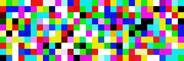
Choosing a color scheme that's too chaotic
with too many colors can overwhelm the eye, and something you may think
is colorful or vibrant instead becomes muddy or dull.
While the image on the left might be considered colorful, from far
away, the same image may feel like all the colors average out to grey.
This is
why many color schemes are limited to just 2-3 colors, and follow color
rules such as complementary colors or analogous colors. That being
said, this doesn't mean you can't use all of the color of
the rainbow in your painting, but you'll need to carefully have 1 or 2
colors more dominant over the rest to achieve balance.
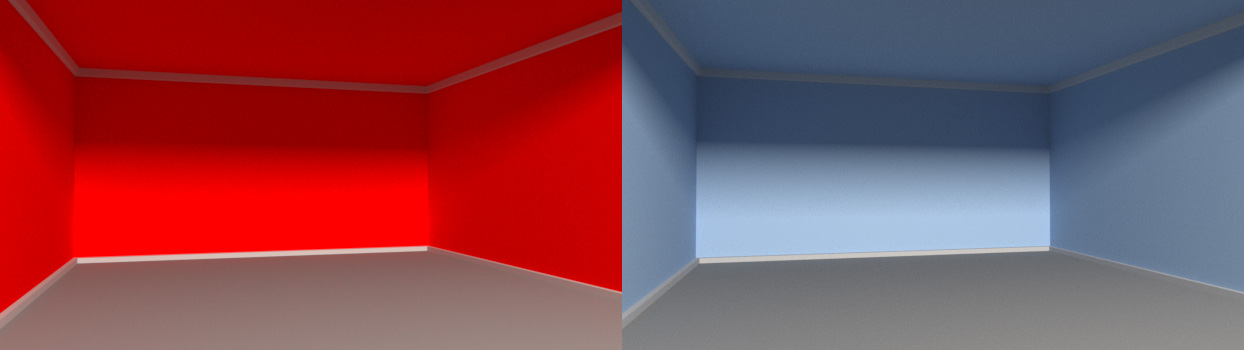
2) Colors That Recede vs
Colors That Jump Forward
A bright neon red room will seem smaller than a
desaturated blue room because the color in the red room excites the
rods and cones in your eyes, causing the walls to appear to jump
forward. The desaturated blue calms the eyes, and so appear to recede
back. You can use this to both create a focal point in a painting, or
to provide a 3d space with an appropriate vibe.
3) Perception Of Colors Is Not
Absolute,
But Relative
You may have seen this optical illusion before,
despite the fact the smaller squares are exactly the same color values
(RGB 212, 116, 67), they appear to be brighter or darker or more or
less saturated depending on their background color.
Here's another example below, does the square in the middle feel
slightly blue to you? It's not, it's a completely neutral desaturated
color. It feels like a cooler blue color because it's surrounded by
such a warm color.
This is called "Color Relativity", and was a subject heavily explored
by Josef Albers and Yohannes Itten who taught at the Bauhaus school in
Germany, and are considered some of the most important influential art
teachers of the 20th century.
In short, when picking a color, remember that whatever color you pick
will be affected by the colors around it. So its not enough to consider
just a single color by itself, but how it relates to the different
colors it interacts with. This can affect color choice in paintings,
but more heavily affects color choices in film and games, since these
mediums involve colors moving from one location to another over time.
Our visual center has two systems running in
parallel. There's the...
Old visual system (Where): motion, spatial, depth, can't see
color
Newer visual system (What, only in primates): object, faces,
color
When we see something, what we see gets processed by these two systems
independently in separate parts of the
brain. Since the old system was the first to evolve, it is more
advanced than the newer system. So the brain is far more sensitive to
changes in Value than in Hue / Saturation.
As an example of this, when 2 colors have the same value but radically
different hue, it
causes a strange look, it seems to almost move on the screen.
This is because the "where" part of the
brain can't see any different between the text and the background, see
below when we desaturate the color...
The "Where" part of the brain sees nothing, but the "What" part of the
brain can see the difference in hue. So basically two parts of your
brain disagree about whether there's anything there, which causes it to
shimmer.
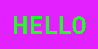
We can use this principal in a number of ways.
First off, if we want to really over stimulate the visual system,
try a color combination like the pink and green above, it will make the
viewer think the image is really "bright", even though the value has
not changed.
The second thing is when making a painting, spend more time on
getting your value correct, having perfect colors won't matter as much.
Our visual system for value has much finer detail, and our color system
is more coarse, like a high res image vs a lowres image. For example,
if you have a high contrast value border, and then you just roughly
paint in the color, our mind will spread that color until it hits that
contrast border. This is why in a coloring book, keeping color within
the lines isn't that important, the mind will adjust the color to fill
the nearby high contrast border values (the black lines).
5) Color Blindness
Despite consistency in how people's eyes react
to certain colors, some people suffer from color blindness, and so
certain palettes will produce
confusion.
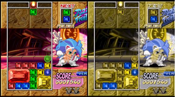
The image below is from Super Puzzle Fighter II Turbo as seen by
someone with normal eyes and
by someone with Deuteranopia (a red-green color deficit)
You should keep this in mind when choosing colors, for example, if the
two colors you've chosen for the protagonist and
antagonists in a film are seen as identical to someone who has a common
form of
color blindness, that will interfere with their ability to tell them
apart. So certain color choices may be best avoided, or if not, extra
work may need to be done, for example in a film make sure the shapes of
your main characters are really different since the color difference
won't be obvious, or in videogames add special color blind related
modes that modify the
colors algorithmically for people who have these accessibility issues.