Go here
to read this tutorial in Indonesian.
Go here
and here for a
fantastic talk on the subject by Gleb Alexandrov.
Introduction
This theory in composition goes by many names...
You have two choices with this lesson, watch me discuss the issue in the video below, or read the full text.
First, a definition. Primary shapes are your big shapes. If you
squint at an image, the details tend to disappear and you're left
with only your big shapes.
Secondary shapes are the smaller shapes that either sit on top of,
or
help make up the primary shapes.
Tertiary shapes are again smaller than the secondary shapes, they
are the tiny details that add visual interest.
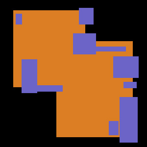
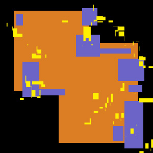
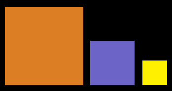
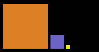
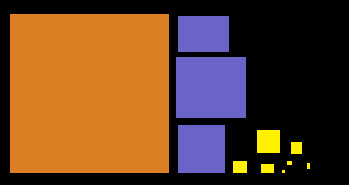
Here's three 2D diagrams showing primary, secondary and tertiary
shapes
in a fake composition. These 2d rules work exactly the same in 3
dimensions.

Here's another similar diagram...
The Important Questions
Now that you know what primary,
secondary and tertiary
shapes are, here's 3 important questions...
So these could be primary, secondary and tertiary shapes sizes....
But so can these...
And these...
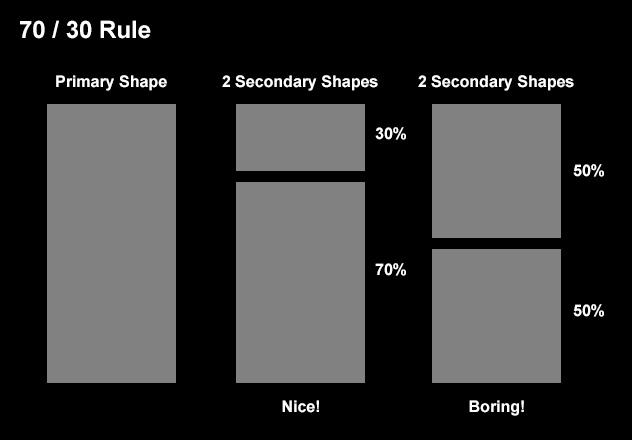
The same works for tertiary shapes. If you break up a secondary
shape into multiple tertiary shapes, consider breaking it up into a
bunch of tertiary shapes that are 30% the size of the secondary shapes.
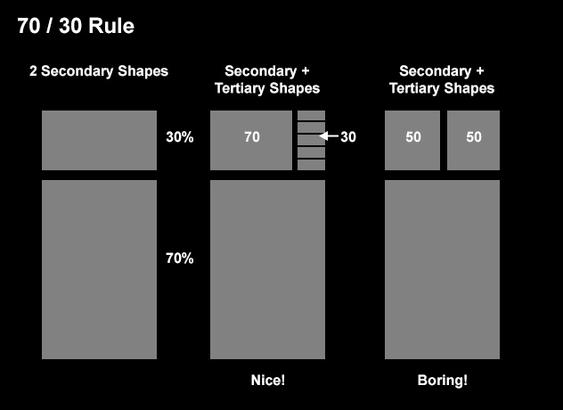
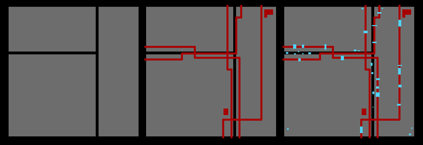
Where Should They Go?
Next comes the distribution of these details. Take a look at this image, it has all 3 levels of detail, but the tertiary shapes are in one uniform block...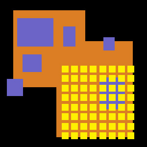
Many images suffer from this problem, huge blocks of small
repeating patterns. For example, if you are a 3d artist just starting
out, and need a dirt ground, you're likely to make an image like this
by placing a standard procedural pattern on a ground plane...
This does not provide the eye any spot to rest, and hence doesn't
look very natural. So in general you
want to vary the placement of your tertiary details so that they are
more
random, and have several areas of detail, and several areas of no
detail.
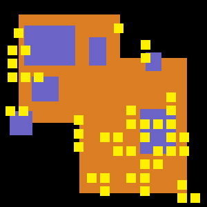
Notice how this is easier to digest. The eye can look at the
detailed lower right corner, then move to the center of the image and
rest there for a moment (in the big area of little detail) before
looking at more tertiary details elsewhere.
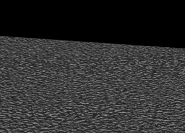
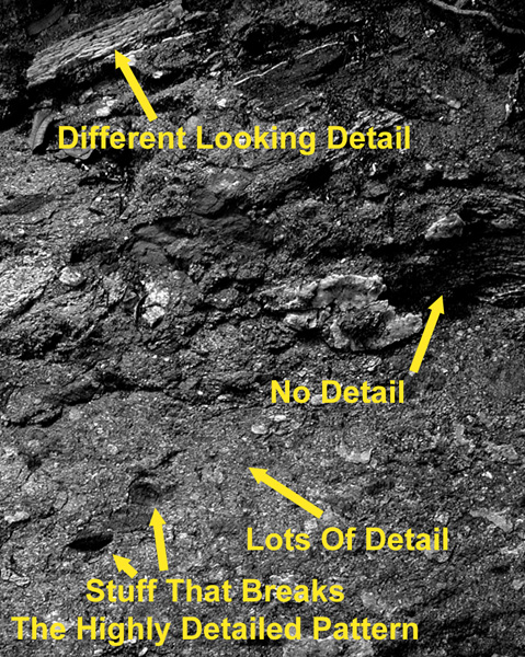
A Photographic Example
Remember that noisy ground plane above? Let's fix it by looking at a
photo of a real dirt ground. Notice the variety in the
patterns.
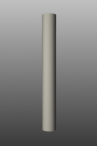
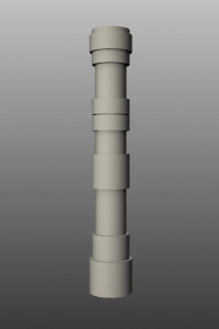
A 3D Example
Here's another example of building up shapes. First, lets start
with a cylinder, maybe this will be a pipe for a robot.
Now lets place some secondary shapes, rings around the pipe.
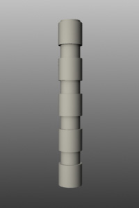
Now that's more interesting, but the regular pattern is kind of
boring. Lets vary the position of the secondary rings...
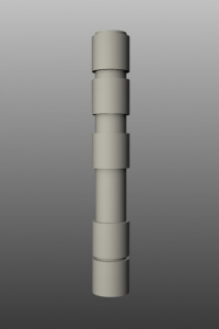
Better, but all the secondary shapes are the same size, lets vary
the sizes a bit...
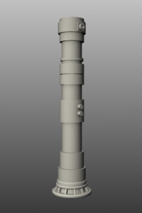
Now we have a well balanced composition.
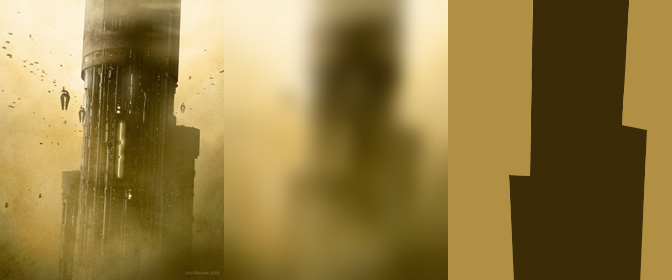
Examples From My Artwork
Here's a few paint-overs of some images that I made in the past, showing off the primary, secondary and tertiary shapes...
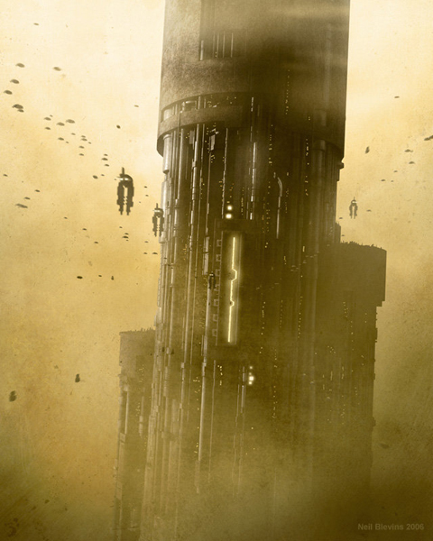
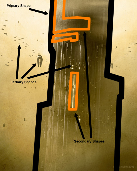
In this case, the giant tower is the primary
shape (a cylinder). That shape is made up of many secondary shapes,
pipes and large
pieces of concrete, and the entrance. The tertiary shapes are the tiny
ships, and tiny
lights along the surface of the tower, many of which are just a few
pixels large.
This helps give the piece a good sense of scale.
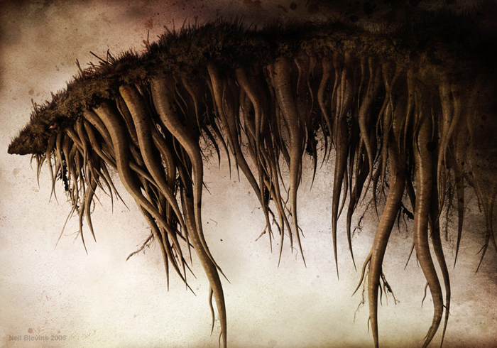
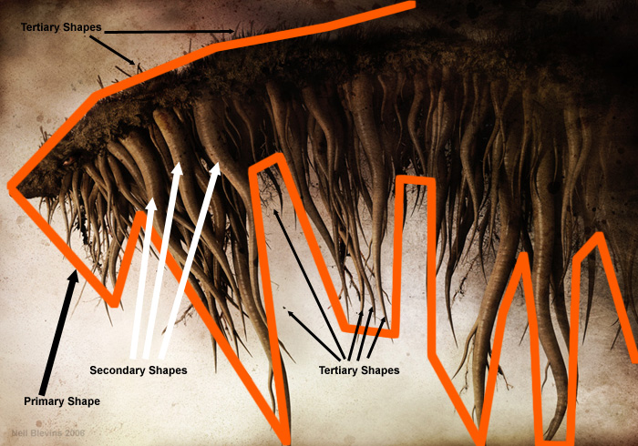
The primary shape is the shape made by the
creature against the background. Then there's some larger tentacles,
which are secondary shapes. Then there are more tiny tentacles, and
grass, etc., which are tertiary shapes. If the image had no tertiary
shapes, it would feel like something's missing.

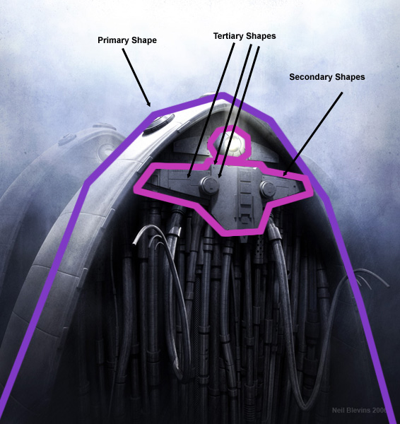
Robots are a great opportunity for practicing "Big, Medium, Small". In this image, the larger shape of the creature is the primary shape. Then that has secondary shapes on it like the front panel or eye. Then those have tiny tertiary shapes on them as well, such as nuts, panel lines, small raised panels, etc. Also note that there aren't tertiary shapes everywhere on the secondary shapes, there are areas of lots of detail, and areas of no detail. Also notice just how small some of the tertiary shapes are compared to the secondary shapes.
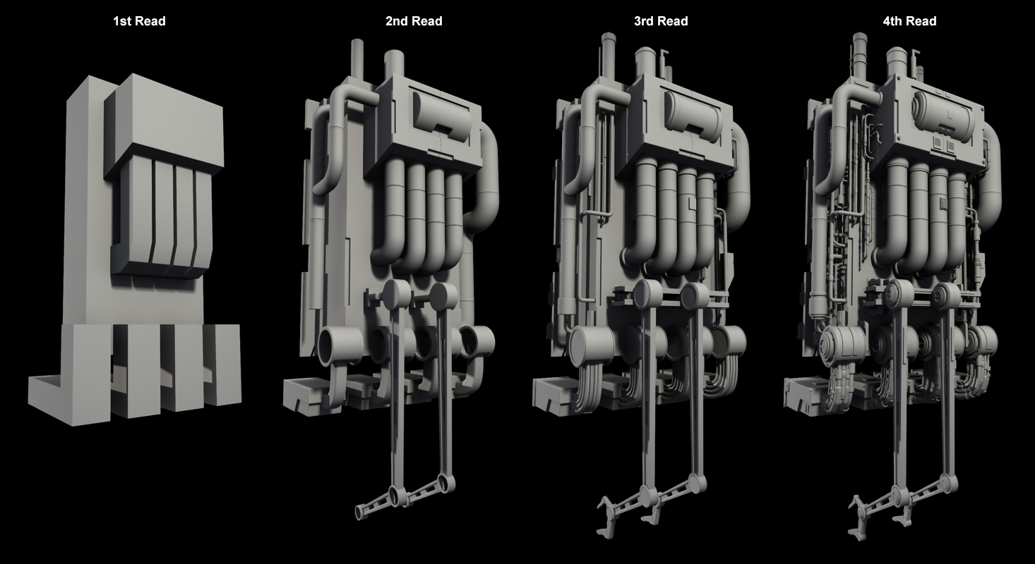
Robot Example
Here's an example of a floating loader robot.
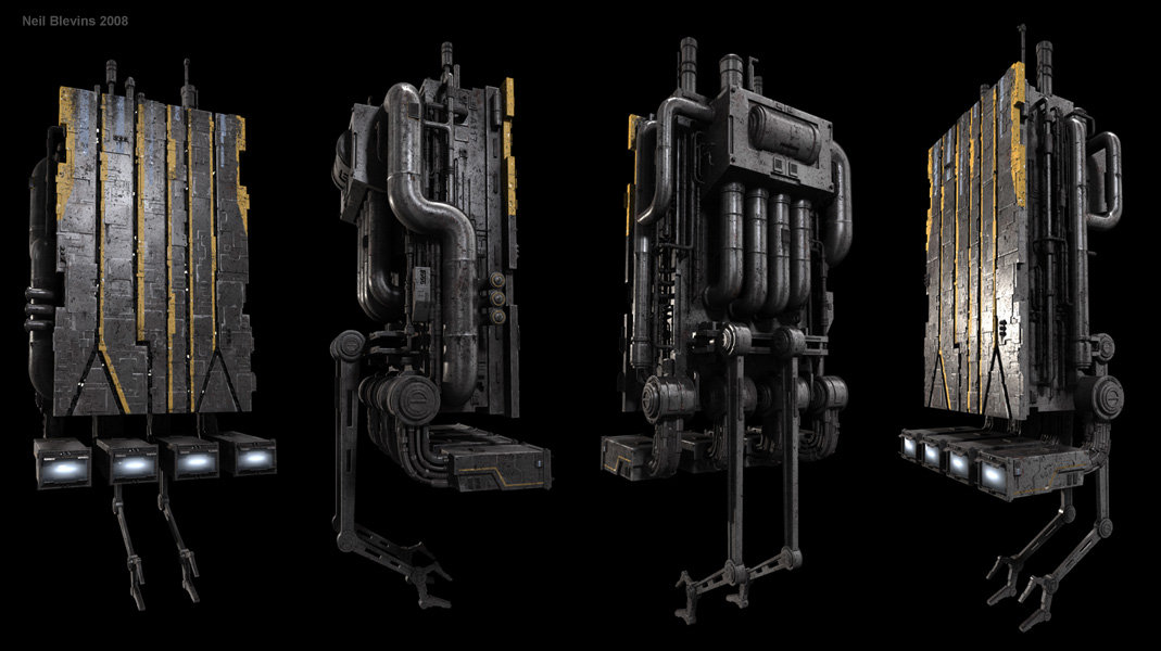
Now let's look more closely at the distribution of
detail.
Conclusion
To summarize, when making your images...