This lesson is about adding variety to your color schemes.
You have two choices with this lesson, watch me discuss the issue in
the video below, or read the full text.
I can't take credit for the first version of this lesson, it was
first taught to me at age 6 when I attended art classes with
Canadian Wildlife painter
Renate
Heidersdorf. I was very lucky to get a place in one of her
afterschool classes, and I thank her for this invaluable lesson that I
still use today.
Every year in the fall, classes started out with us doing a nature
painting. When I was like 7 or 8, we did the following, first, open
the ink that was called "Green". Place it on the paper. Observe the
color. Probably medium brightness, not quite neon, but very generic.
Then in the next 20 minutes we had to mix on the paper 20 different
greens.
Green with yellow mixed in. Green with blue. Green with brown. Dark
greens,
light greens, Lime greens. As many different greens as we could make.

The purpose of the exercise was to realize that just because this ink was called "green" does not mean it should be used to paint anything we know to be "green".
Once we finished this exercise, we then painted a nature scene of some sort. And of course, we were expected to use lots of different greens, different greens for different trees, grass and plants.
The Rules
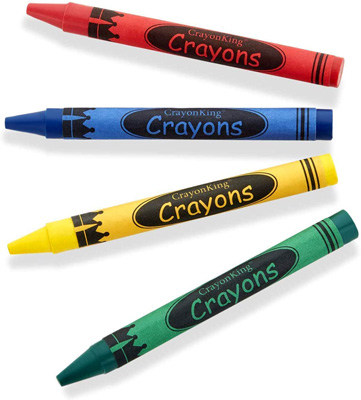
Now, it may seem odd to have small children follow a rule like this,
"No premade green is allowed in your painting". But in fact, it is not
a rule as much as a method of breaking the rules. When we are small and
are holding our first crayon, we have total freedom. If we want to make
the sky green, we can make the sky green. I mean, why not, if that's
how
our minds saw the sky. But soon afterwards, we start looking to our
parents
for answers to our questions. Such as, "what color is that tree?'
"Well,
it's green". "What color is that grass?" "It's green." "What color is
that
car?" "It's green". Pretty soon, we have all the answers we need, all
of
these things are now categorized, they are all green. So no wonder when
a person starts making artwork, they immediately reach for that generic
green
for the grass and trees. After all, they're all green, this
crayon says green, so I should make them green.
This is the difference between painting what you see and what you know. In the book "Mass" by John Harris, he explains how he had a teacher who was convinced that is was more important to paint what you saw then what you knew. As in, forget that you know what that object is, paint the lights, paint the darks, paint the color, paint the shapes, and eventually the object will just take care of itself. Try this as an exercise sometime, find something and try painting what you actually see vs what you know the object looks like. Your observation skills will multiply in no time. And all of a sudden you see how the object really looks outside of what we expect it to look like.
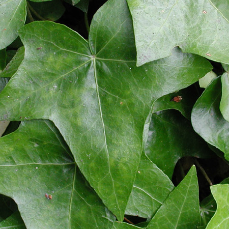
The Natural WorldLets take a few shots of the natural world. Here's a patch of ivy, notice the huge variety of greens, some leaves are light, some are dark. Some are in shadow...
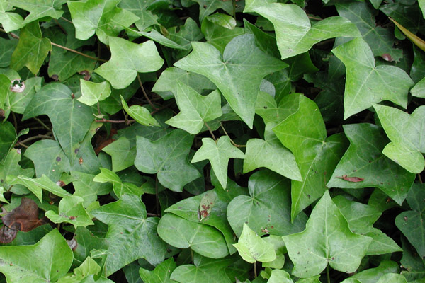
Even upon close inspection, the leaves themselves are different colors, with veins and spots and other detail, many, many different greens.
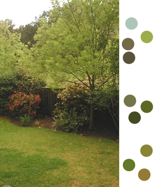
And here's a lovely garden scene, plenty of different greens there,
I've picked a few of the colors and placed them on the right side for
you with Photoshop's color picker.
Lets Make Some Grass
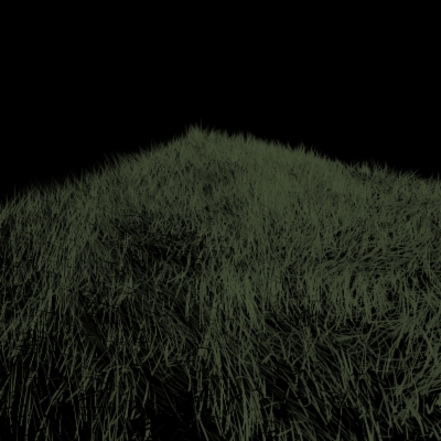
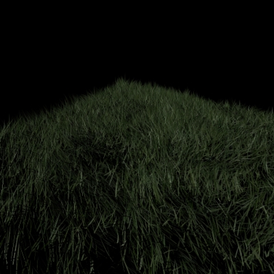
Following these ideas, lets make some grass. Below is a picture of some simple 3D grass, with a generic green color. Ok, looks good, but there's something missing. The eye sorta gets lost in the grass, since it's all the same bland color.
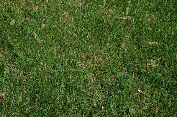
Here's some real grass, notice the variety in greens...
So let's add some greens variety. Thankfully, I can apply a bitmap to this 3D grass to specify the color of the blades of grass. Here's a bitmap, imagine this projected from above the grass. When a blade of grass grows, it chooses it's color based on the color of this image at the position the grass is growing. So if it grows from a pixel that's black, the grass itself will be black at that point.
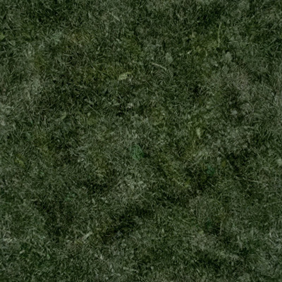
And here's the map applied to the grass. Notice how this adds variety and ends up being more pleasing to the eye, as well as more realistic.
Conclusion
So next time you are painting a painting or texturing a 3d scene,
don't pull out that single color crayon. Make sure to add variety to
the colors, the results will be more believable and visually
interesting.