Evaluating Contrast And Exposure
Values With A Histogram By Neil Blevins Created On: July 21st 2025 Updated On: Oct 16th 2025 Software: Any
When making any sort of image, whether its a 2d or 3d animation, a
shot for a live action film, a piece of concept art, or an
illustration, the
values you use are an important element to getting and holding people's
attention. This lesson discusses how to visualize values in an image
using a histogram, and what contrast of values are more pleasing to the
eye in most situations.
What Are Values?
The value of a pixel in a digital image is the equivalent
of "Brightness". So the higher the value, the closer the pixel is to
white. And the lower the value, the closer it is to black. If you take
an image...
and remove all of the color information, you get a grayscale
image, which is all values of black, grey and white.
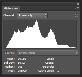
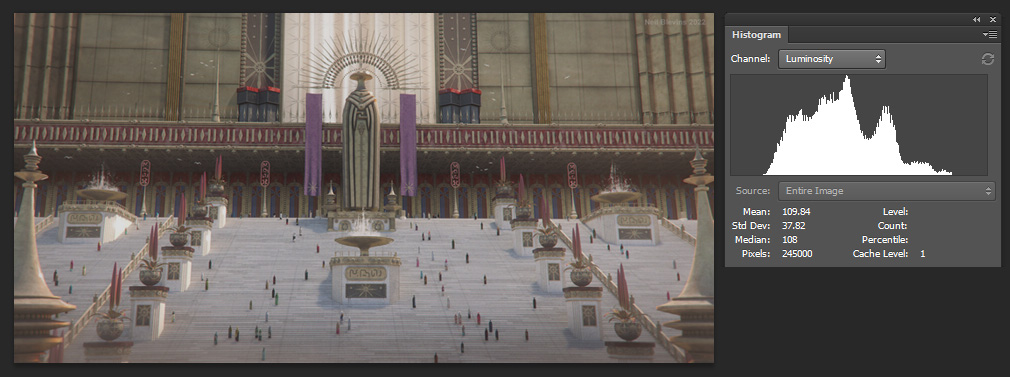
Histograms
A Histogram is a chart that lets you see the brightness or "Value" in
all the pixels of the image. It's X axis is the value of a pixel, and
the Y axis is how many pixels have that value. Pretty much any piece of
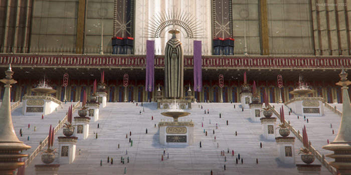
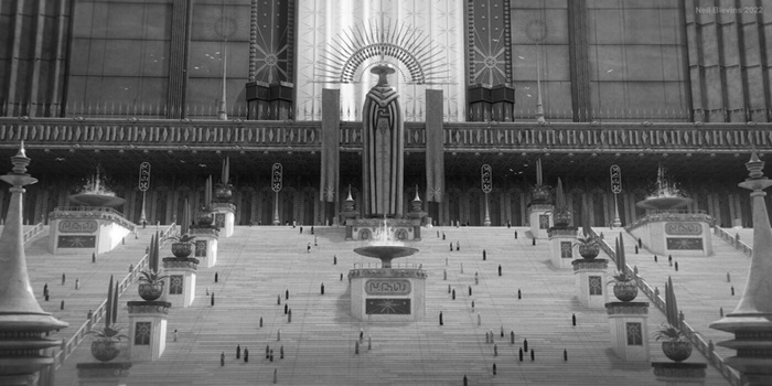
art software has a histogram feature, here's an example in Photoshop.
In general, an image looks best if you have a histogram that's spread
out over the full range of brightness values. This doesn't mean you
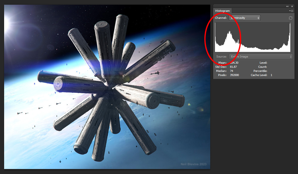
can't have peaks in the histogram, for example, if you have an image in
space, you may see a large peak in the blacks:
This is normal and not a problem in this particular image because
overall there's a decent amount of values in the full spectrum between
black and white, even if one area has an extra amount.
When
evaluating your image's values, there are two main things to
consider, the Exposure of the image, and the Contrast of the image.
Exposure
To discuss the placement of our histogram curve, we'll use a term more
commonly used in Photography (but can be used for any image, including
paintings). That term is Exposure.
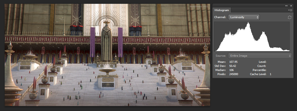
An image is defined as "Over Exposed" if there's too much white in the
image and not enough black (ie, the curve is skewed towards white). See
the corresponding histogram and the image it represents.
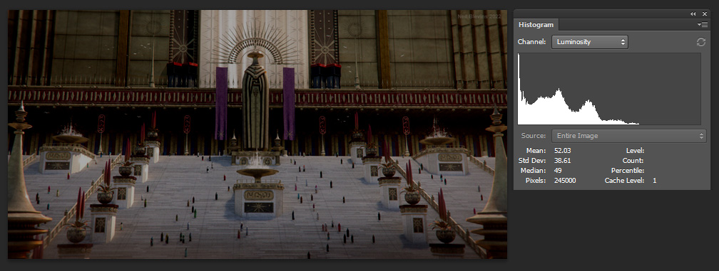
An image is defined as "Under Exposed" if there's too much black in the
image and not enough white (ie, the curve is skewed towards black). See
the corresponding histogram and the image it represents.
While you may want an image like this to create a special effect, in
general you want to avoid images that look like this, and have an image
that doesn't skew in either direction, creating a balanced exposure.
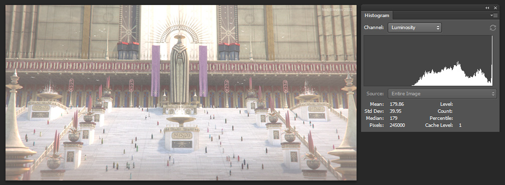
See
the image below, this has a much more balanced histogram.
Contrast
While Exposure defines the position of the values on your histogram,
"Contrast" refers to the width of the curve. Ideally you want a curve
that covers the entire value range from back to white, or has the
largest width between the highs and lows. A common mistake you see with
imagery is having not enough contrast.
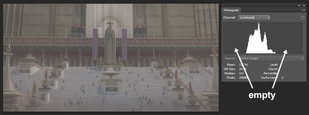
This is where the curve isn't very wide at all, and your darkest color
is a
slightly darker grey and your brightest value is a slightly lighter
grey. This is best avoided as it's tougher for the eye to digest.
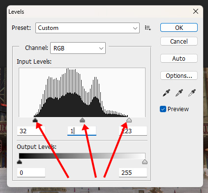
Adjusting Your Exposure And
Contrast
Most applications have ways to adjust the brights and darks in your
image after the fact. So if you're painting a painting, once done, your
last step should be adjusting the values to get that nice spread
between and darks and lights. For example, in Photoshop there's an
adjustment layer called "Levels".
See the image below. There are no pure blacks or whites in the image at
all. This is low contrast.
So apply a Levels on the top of the layer stack and adjust the bright
point, the dark point, and the midpoint so that your final image has
good contrast.
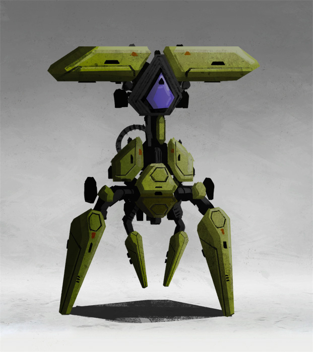
Character Sheets vs Key Art
These rules apply regardless of subject. We've focused on
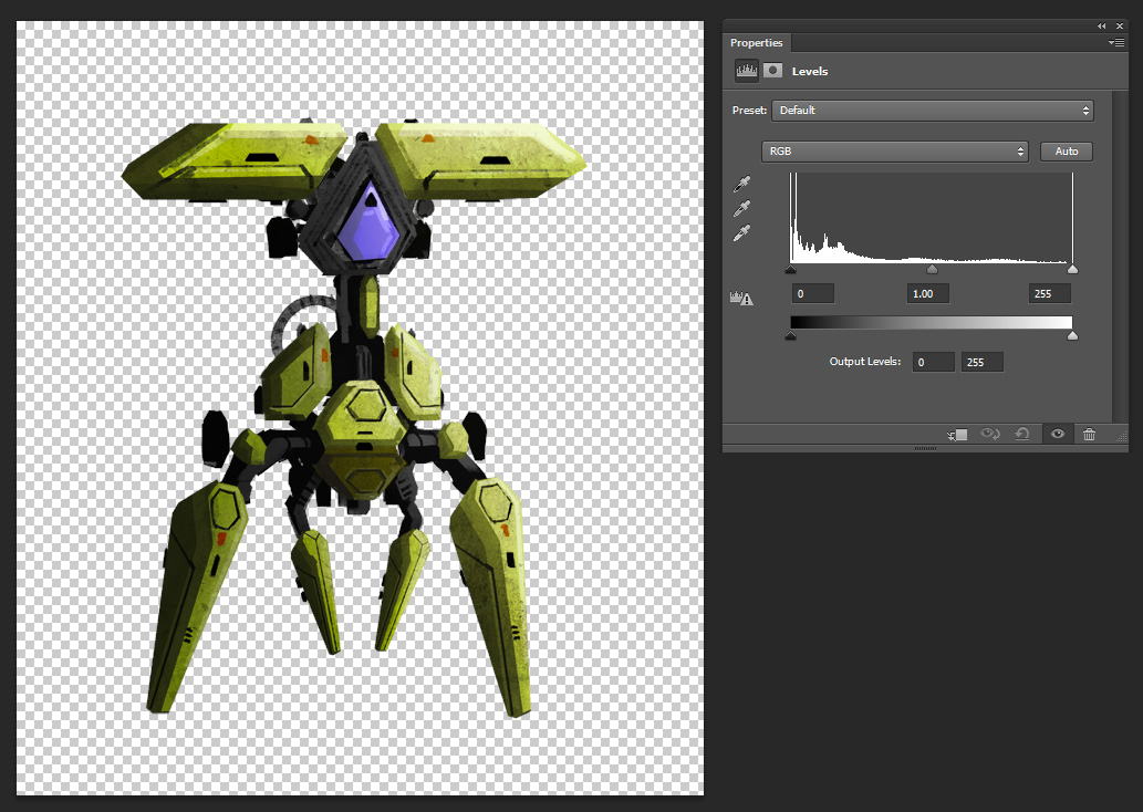
environmental key art so far, but let's look at a character concept.
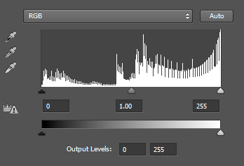
If you look at the histogram, you can argue that there's a good variety
of values...
But this is a little misleading. The bright background is adding a
bunch of values to the right of the histogram, but the spider robot is
all within a very short band on the left, and is heavily under exposed.
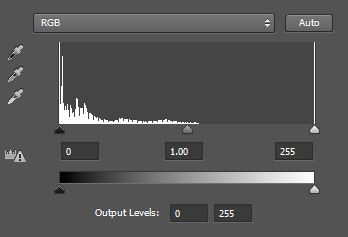
So what happens to the histogram if I remove the background? You can
now see how under exposed the character is.
For a character concept sheet like this, I'd recommend the character's
range goes from 0-100% brightness. Keep 95% of your values between
10-90% brightness, and reserve pure white and black for the absolute
brightest of specular highlights or the absolute darkest part of your
shadows.
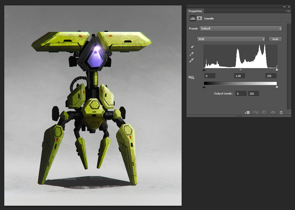
For the background, start with a middle grey (50% brightness). Now just
a flat grey background color is a little boring, so instead you can do
a gradient from say 30-70% brightness. And if your character starts to
blend with the background due to its local color, add a rim light to
separate it from the back.
Now your character painting is a little more balanced overall.
Conclusion
So next time you're making an image, make sure to check its exposure
and contrast at the end. Again, it's not necessary for every image to
have an even spread of values to be effective...
But in general avoiding images that are under or over exposed and have
no contrast will be more pleasing to the eye. So feel free to make any
needed adjustments so you have a good spread of values between black
and white.