The Big Shapes,
Designing An Alien Mothership
By Neil Blevins
Created On: Oct 15th 2017
Software: None
This tutorial discusses the process we
went through to design the alien mothership. Watch the video below, or
follow along for
the tutorial in text and images...
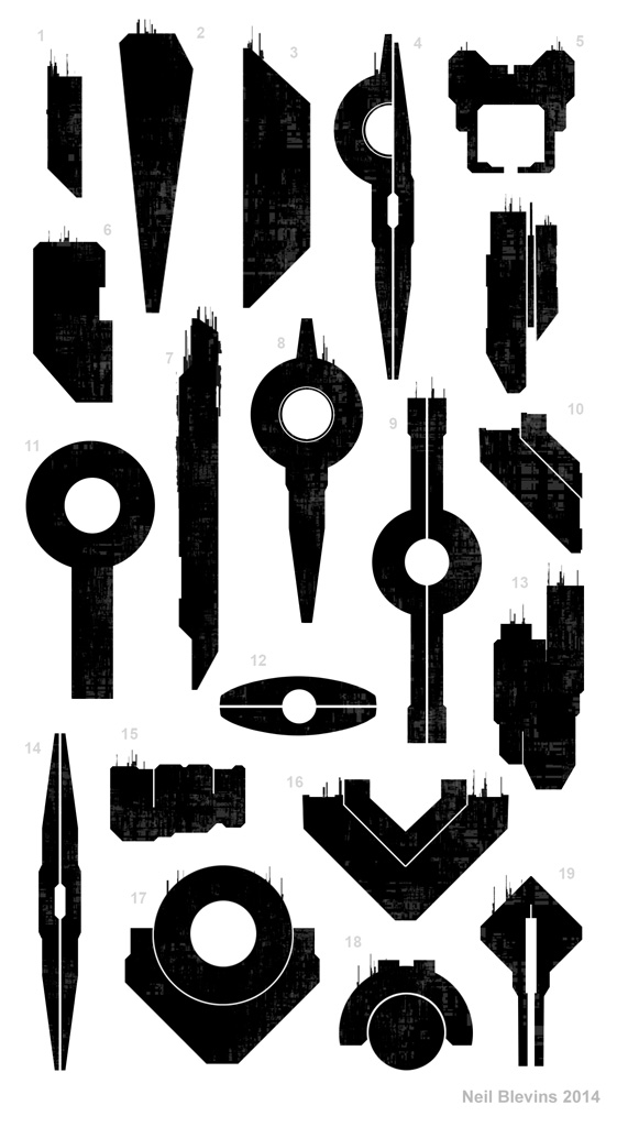
Here are a series of small thumbnails for the alien mothership.

While The Story Of Inc is currently a book, it was conceived as a
"Concept Art Book For A Film That Doesn't Exist", and as such the
design mantra was the same as if we were designing for film.
One of the most important concepts while designing for film is a strong
silhouette. In a book, you can stare at a design for a long time,
noticing all of its intricacies. But in film, you may only see a design
on screen for a couple of seconds. And in those seconds you need to be
able to tell what it is and what its doing.
"The Story of Inc" artist and writer Bill Zahn has a number of rules he
likes to follow when designing for film, one of which is you need to be
able to describe a design in a single sentence. For example, a Tie
Fighter from Star Wars is a flying H, the Millennium Falcon is a plate
with a chunk cut out at the front, or perhaps the simplest of all, the
Death Star is a sphere with a crater. These are an example of good,
simple, elegant design. Following in that same spirit, Inc is basically
a trash can with arms and legs. The Citadel is a 3 sided block. And the
alien mothership is a donut with two long towers extending out on
either end.
The first step was exploring a number of shapes, letting the mind free.
Next the editing process, remove any designs that looked too similar to
designs we've seen before. Then see which remaining designs seem to
resonate.
The shape language of the final ship design carries through every
aspect of the alien race. The mothership was actually the first thing
designed, so once it established the donut motif, the same was carried
through with the alien species. And the triangular elements were added
to connect the ship with its main cargo.
Here's the major take home points:
- Strong, simple and iconic silhouette is important
- Simpler silhouette is good for film because the design goes by so
quickly
- Design is strong if you can describe it in a short sentence
- Larger objects also tend to have simpler major shapes
- Using the same shape language in different designs link them
together
Try and follow some of these rules next time you make a design and see
how it can improve your final result.
This site is ©2026 by Neil Blevins, All rights
are reserved.
To see hundreds of other tutorials similar to this one, visit the
Neil Blevins Education Site

