Specular Reflections
By Neil Blevins
Created On: Feb 4th 2001
Updated On: Dec 8th 2024
Software: Any
This tutorial will discuss Specular Reflections (sometimes referred
to as Highlights as well) in the real
world, and how they're simulated in your CG scenes. It will also touch
on the topics of fresnel and IOR, rough vs smooth reflections, and
metallic and non metallic surfaces.
While I'll be using 3dsmax to illustrate the examples, what I'm
talking about is meant to be non software specific, and should work the
same in any commercially available 3d app
and renderer.
Specular Reflections
The most common material you'll make a CG object is a combination of
Diffuse
Reflections and Specular Reflections. So what are Specular
Reflections? When light hits a surface, part
of the surface will scatter light back in a much more focused manner
(compared to the diffuse).
Some great examples are your reflection in a mirror, or the glint of
the sun on a metallic surface, or the shine on a plastic surface.
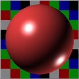
The shader ball below shows both Diffuse and Specular Reflections,
the diffuse provides the red color, and the specular reflection
provides the bright highlight.
The Truth About Highlights
In old school computer graphics, a Specular Reflection was generally
broken up
into two parts, Highlights and Reflections. This was because
calculating Raytraced Reflections
were expensive, so you tended to not have Reflections on a surface, and
instead you only had a Highlight, which was a simplification of a
specular reflection that was easy to calculate (usually a variation of
the Blinn or Phong models). Highlights were controlled using Specular
controls, such as shininess strength and glossiness. And then as
computers got faster in the early 2000s, a second set of controls were
added to give your
material Raytraced Reflections. That added a second set of controls,
one for your Highlight, and
one for your Reflection. But in the
real
world, there is no difference between a Reflection and a Highlight.
What we call a Highlight
is just a Reflection of a point light source on your surface (the light
is sent from an infinitely small
point
to
the objects it illuminates). Real lights don't work this way, light is
emitted
from an area, such as your light bulb, and as such, real Highlights
come in all sorts of shapes and sizes, most of which are not round.
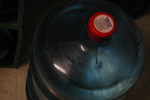
Take a look at the picture above, you see these little highlights on
the plastic, not too far off from a standard Blinn Highlight.
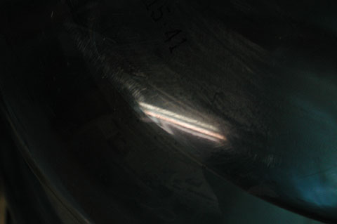
We get closer, and we see the Highlight isn't an oval shape, but a
Reflection...
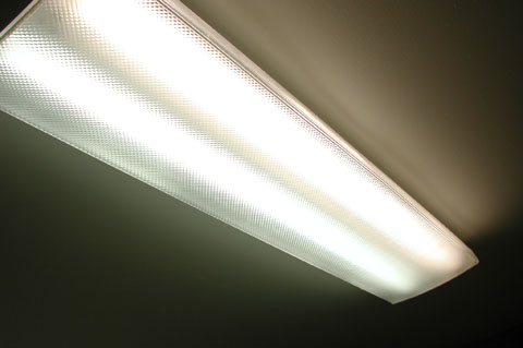
...of our light source overhead.
These days, most
renderers do Reflections quick and easy, and we've replaced point
lights with area lights, so you don't need to use the
highlight cheat
anymore. No more two separate controls, just change the Specular
Reflectivity of your surface and the
software controls everything for you.
Additive vs Default
Reflections
Different materials in your cg software provide either Additive
reflections or proper
Energy Conservation based reflections. What's the difference? In
additive, the specular reflection is added to your diffuse color. With
Energy conservation, it places the specular reflection over the diffuse
reflection. That way, if you have a really bright specular reflection,
your diffuse reflection will get darker automatically. For more info on
Energy Conservation, please read Energy
Conservation In Shaders.
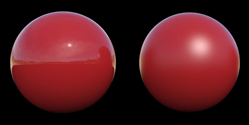
Look at this image...
The material to the left is a 3dsmax Scanline Renderer Raytrace
Material using Additive mode, the material on the
right uses Default mode. So based on what we learned about Energy
Conservation, the left sphere that mixes a strong Specular Reflection
with a high
amount of Diffuse reflection (the blue of the ball) is not a natural
phenomenon, and should be avoided. The right sphere is a more natural
specular reflection. More modern materials such as the VrayMtl in vray
do energy conservation automatically (and so would look like the right
sphere), and so are better to use. Of if your renderer only does
additive mode, you can always do energy conservation manually by
reducing the brightness
of your diffuse if you're going to increase the specular reflection to
avoid the over bright sphere as in the example above.
Fresnel and IOR
So now that most renderers give us true specular reflections, how do
we control the strength of these reflections? This
brings
us to the concept of Fresnel and IOR. Materials are assigned an IOR
based
on how they reflect light (IOR stands for Index Of Refraction, but even
non refractive objects such as metals have an IOR, usually referred to
as a "complex IOR". A complex IOR measures a slightly different
property
then a regular IOR, but it deals with the same stuff, light reflecting
or refracting off / through a surface). As a surface starts facing away
from the viewer, it reflects more then a surface that is directly
facing
a viewer.
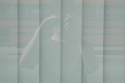
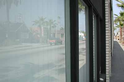
Here's a reflective glass surface. Notice how it's less reflective
when I look
directly at it from the front vs looking at it from a side angle. The
greater the angle
the more it reflects.
On round surface like a sphere (as opposed to a flat surface like
the glass),
this means the edges of the sphere will reflect more Specular light
then the
front of the sphere. This phenomenon is called Fresnel.
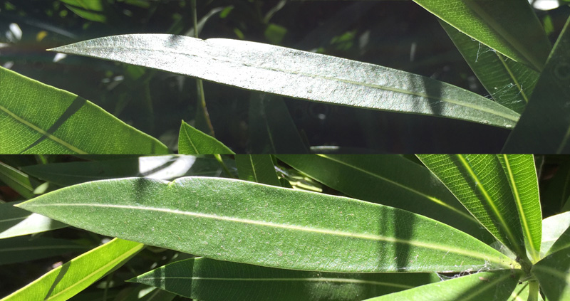
Here's another example, as we see more of the leaf's side angle, it
reflects more of the sun...
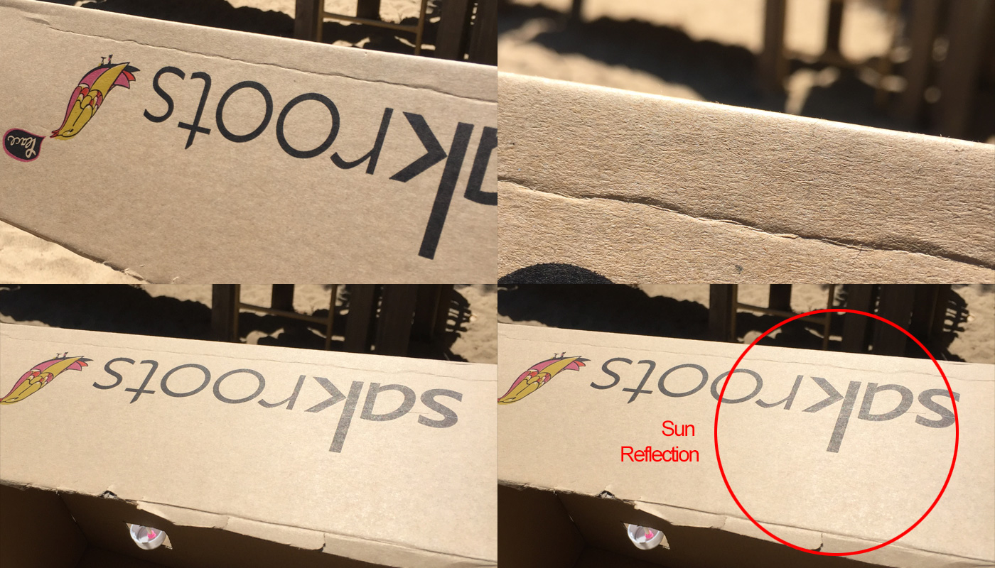
All surfaces have some amount of fresnel, even ones that may seem
very diffuse and not specular. At a very grazing angle, you'll see the
fresnel reflection kick in. Even stuff like cardboard (which is pretty
rough) has fresnel...
Different renderers have different ways to do Fresnel, most have a
checkbox or do fresnel automatically, and then provide an IOR value to
change.
Different types of real world materials
have
different IORs, some good example are air is 1.0, glass has an IOR of
about
1.5, plastic between 1.1 and 2.0, gloss materials such as porcelain or
car paint 3-5, super shiny
metals
like chrome a value of 10-20. The IOR controls the proportion between
how
much the faces pointing away from your reflect vs the faces pointing
towards
you. For example, a lower IOR means that the away faces will reflect a
lot, and the faces facing your reflect very little, and a higher IOR
will
make just about all faces of your object reflect the scene the same
amount.

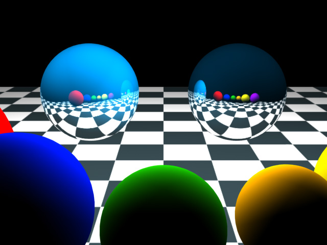
An IOR of 1.5 on the left, and IOR 5.0 on the right, reflecting a
checkerboard environment.
Glossy Specular Reflections
Depending on how rough your surface is, your specular reflections may
also be glossy. A Glossy Specular Reflection is like a perfect mirror,
you see a sharp copy of the environment on the surface. A Rough
Specular Reflection (low glossiness) will have a blurry reflection, as
the reflection is
disturbed by the roughness of your surface.
For more info on Glossy
Specular Reflections, please read Brushed
Metal Material.
Metals vs Non Metals
So the main difference between metals and non metals are...
- Non metals (Dielectrics)
- non metal materials that don't conduct electricity, like plastic
- tend to have a lower IOR (hence, more diffuse reflection and
less specular reflection)
- the color of the reflection is the same as the thing its
reflecting
- Metals (Conductives)
- materials that do conduct electricity, like metals
- tend to have a higher IOR (hence, more specular and less
diffuse)
- can have reflections that are tinted by the color of the metal.
Chrome
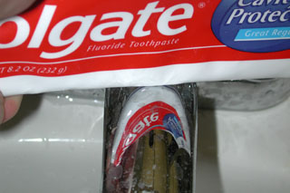
Knowing this, a recipe for chrome would be:
- IOR of 10-20
- a black diffuse color
- high specular reflection that's very glossy (not blurry)
Here's an example of real chrome reflecting a toothpaste tube. It's
almost a perfect reflection. Read more on Chrome in the Chrome material
tutorial.
Colored Metals like Gold
Another thing to consider is colored metals (like gold).
As mentioned above, metals can tint the color of their Specular
Reflections. So since gold is
more yellowish in color, its Specular Reflections take on a yellowish
tint.
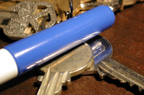
Here's an example, a set of keys and a blue pen. Notice how the grey
key reflects the true color of the pen top, and the golden key tints
the
highlight and pen color the key color. Also note the reflection of the
keys in the pen top, which is plastic. Although on first glance it may
seem like the reflections are tinted blue, it's actually just the blue
diffuse showing through the weaker reflection (remember, as stated
above,
non metals don't tint their reflection). The pen top probably has an
IOR
of somewhere between 2 and 3, the keys are closer to 10, but the
reflections
are broken up a bit since the keys are all scratched up.
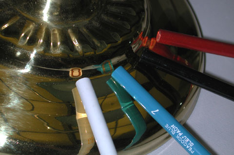
Here's another example, 4 colored pencils reflected in colored
metal.
Notice how all the colors are tinted gold, with the white pencil
appears
the most tinted.
In CG, you usually achieve this by tinting the reflection color. For
example, in Vray for 3dsmax, set the Reflection
color to a golden yellow.
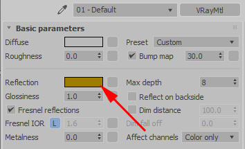
By doing so, the
colors
of the balls being reflected change to approx. the same colors we saw
in
our real world photograph.
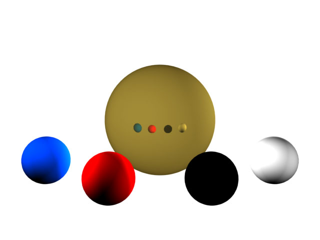
Note that since the ball is in a completely white environment, and
its
IOR is so high (ie, it reflects pretty uniformly over the entire
surface
of the sphere) the sphere is almost entirely gold. If you replaced the
white environment with say a room, this would look more natural since
it would be properly reflecting
everything
in the environment.
How Glossiness Affects How
Reflective An Objects Is
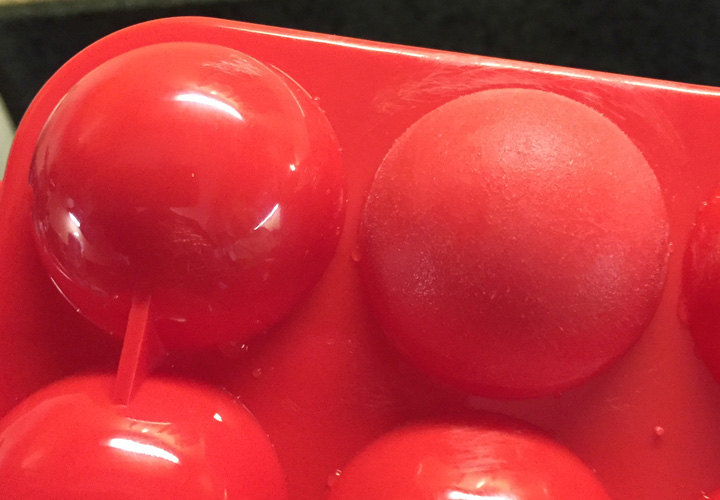
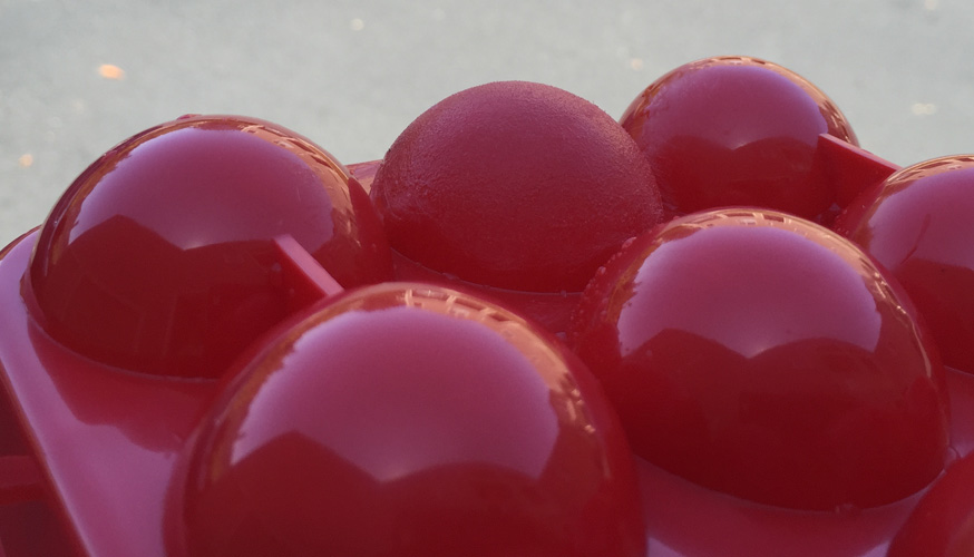
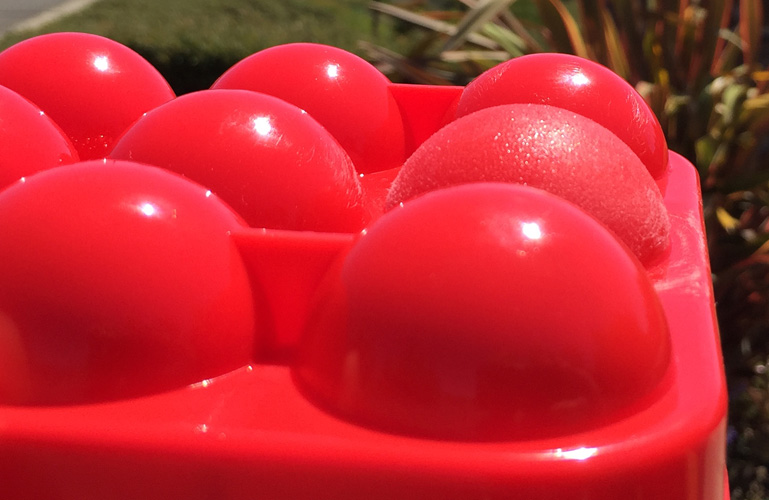
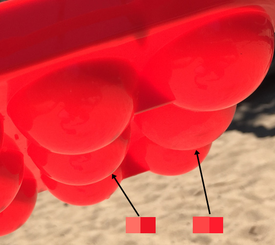
How rough the surface is can affect its reflectivity. Check out the
following photos of a dielectric plastic, Picture 1 is a series of red
balls
that are reflective and with high glossiness (low roughness).
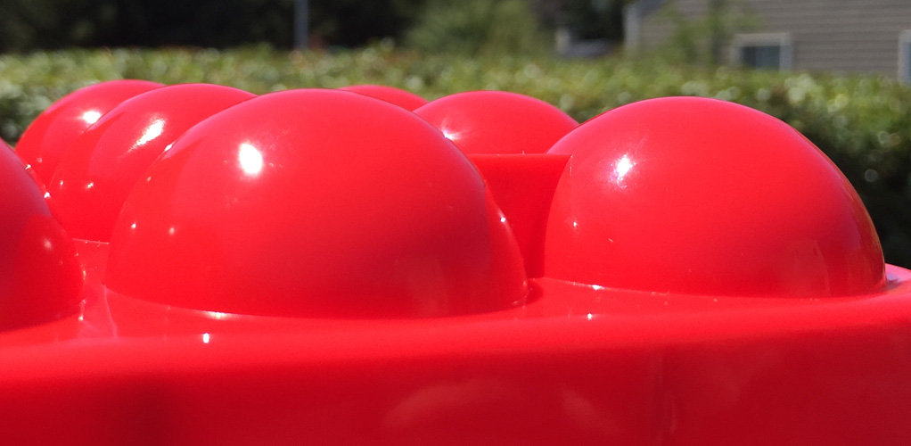
The IOR of the surface is approx. 1.3, notice how the sky reflection is
stronger at the edge and less in the middle, this is a perfect example
of the fresnel edge effect mentioned earlier.
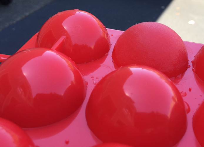
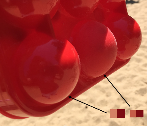
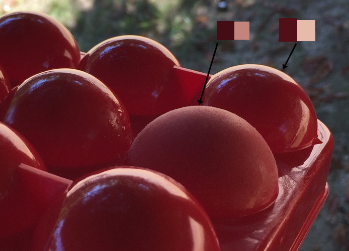
Now I took sandpaper and made one of the balls rough. Notice how the
reflection of the light source is now blurry.
Now lets bring it outside, notice how we can still see a fresnel effect
on the surface, with the edge going brighter than the center.
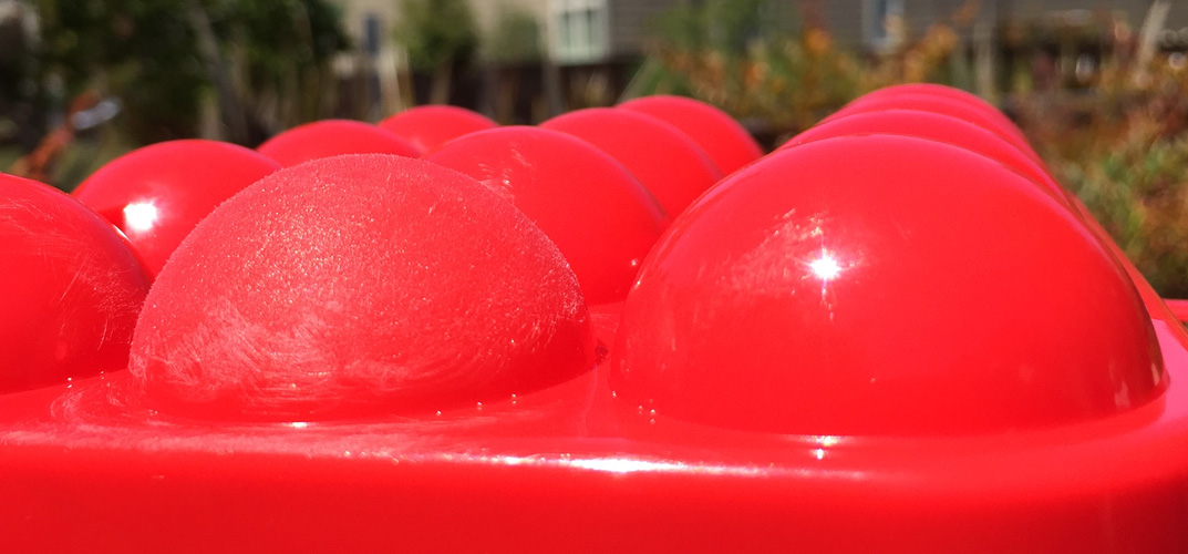
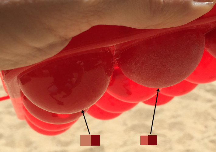
However, note the colors I picked from this photo. On the glossy ball,
you get a bright fresnel edge. On the rough ball, the fresnel edge is
still bright, but not as bright as the glossy ball.
This darkening is caused by a number of effects.
First to recap, the rougher the surface...
- The blurrier the specular reflection
- The dimmer the specular reflection
- The fresnel edge effect is still present
The amount of dimming of the reflection is actually a pretty complex
phenomena that is affected by the following factors....
- Attenuation: At the 90 degree edge of the object, tiny pieces of
the rough surface are no longer pointed at 90 degrees to the camera,
and so you get dimming
- Energy Conservation: Because the reflection is blurred (stretched
out), the reflection at a given point is darker to retain energy
conservation. The rough ball is spreading that energy over a larger
surface, so you have less energy in a
specific spot, like spreading the same amount of butter over a larger
piece of bread, the butter will be thinner.
- Self Shadowing: The tiny pieces of the rough surface shadow each
other, causing some apparent dimming.
- Multi-Scattering: Light rays enter the surface of your object and
then bounce back out at different angles, which actually causes your
reflection to lighten again slightly https://www.youtube.com/watch?v=JtBTffVVa-c&feature=youtu.be
Here's a similar red ball setup in vray for 3dsmax, with 3 spheres, one
with a
Glossiness
of 1, one with a Glossiness of 0.7 and one with a Glossiness of 0.3.
Notice how the amount of brightness at the edge to remains stable.

To achieve more realistic results, the reflection should in fact dim.
But by how much and in what spots is a complex issue, it's not as
simple as the whole reflection getting darker equally, but its also not
about changing the IOR of the surface, because that remains the same
even when the surface is rougher.
Hopefully in the near
future we'll have better equations built into most renderers that take
care of all the various
things that cause the reflection to dim in a more realistic way. Or you
can play with some rough fresnel approximations, such as this one by Rens
Heeren. But
check your renderer of choice and see what options it currently has. If
you're just going to deal with this manually, making the reflection
slightly darker as it gets rougher is probably close enough for rock
and roll.
Reference
Hopefully you find something in here that can help you better
understand
how Specular Reflections in the real world work, and how to simulate
them in 3d.
For my parting words, I can't recommend enough good reference for
whatever
you're doing, in preparing for this tutorial, I really had no idea for
example how the reflections on a colored surface should look. Finding
the
golden object, taking some good reference photos, this told me how
things
should look, and after playing in 3d, I was able to figure out how to
simulate
that look in 3d. Just playing in 3d without reference till I got
something that I thought looked
right
would have taken me a lot longer, and probably would have returned
incorrect
results, trust your eyes, research before you pick up that mouse and
start
texturing. It'll save you a lot of work.
This site is ©2026 by Neil Blevins, All rights
are reserved.
To see hundreds of other tutorials similar to this one, visit the
Neil Blevins Education Site