10 Things To Check Before
Calling A Painting Done By Neil Blevins Created On: June 20th 2022
So you've worked hard all week on a new painting, and you're ready to
call it done. But is it really done? Or have you left something out?
Something that you will regret not fixing later? "Art is never
finished, only abandoned", but before abandoning it, I
run through a list of 10 things to check first. Performing this
checklist, while never creating perfect art, has managed to improve
pretty much every painting I've made in small or large ways. I
sometimes call this my Tweaks phase. So here's some tips to turn that
good painting into a great painting.
You have two choices with this lesson, watch me discuss the issue in
the video below, or read the full text.
1) Does The Painting Tell A Story?
Hopefully this has been an important aspect of your entire process, and
you've worked hard to make artistic decisions to back up your story.
But it's well
worth a final check, sometimes the story can get lost or weakened
during the painting
process. And story doesn't have to be anything complex. If
it's artwork for a movie or book, then sure, you might be illustrating
an actual
story moment. But even something like trying to get a specific mood
across is story. So if my story is "A scary scene where the viewer is
afraid of what horrible thing is hiding in the fog", look at your
painting as objectively as possible, does the painting tell that story?
What's the hook of the image, the thing it's trying to
communicate
that people will find compelling?
2) Composition Check
Check your composition, I have done several tutorials on various
compositional subjects linked below, so do a quick rundown to see if
these various
compositional ideas are as good as they can be...
Dramatic Camera Angle?
Does it have a dramatic camera angle? Or is it straight on your subject?
Compositional Weight: Is
the image visual balanced? Would adding a different crop
improve the painting? Either adding some space to a side, or removing
it? Maybe a wider canvas would give the image more of that filmic look?
Focal Point: Does
everything lead the eye back to the focal point of the
painting? Have you set up appropriate
contrasts to make this happen?
Eye Flow Diagram: Consider
making an eye flow diagram. Create little arrows showing
how the shapes
and contrast areas move the eye around the image. Does the eye move
around the whole image successfully? Does some element of the
composition lead the eye off the
painting by accident?
Layers Of Light And Dark: Are
you using layers
of light and dark to give separation between elements in the
painting?
Perspective Check: it's
so easy during the painting process to
accidentally
flatten things out, even though you were trying to paint something in
say a 3/4 view. Make sure you haven't made any big perspective mistakes.
Depth Cues: Other depth
cues? Does the painting need fog? Does it have
repeating elements that get smaller in the distance? That's a great
technique to create depth. Does the texture on the far
rocks look
smaller on the more distant rocks than on the closer rocks?
3) Color & Light Check
Check the color and light in your image.
Color Complexity: Does
the image have enough color
complexity? It's good to have a
solid color scheme for the image, but are there some nice accidental
colors in there so it isn't too monochromatic? Unless of course the
whole point of the image is to be monochrome.
Overlay Layer To Paint Dark And
Light: To help draw the eye to the important part of the image,
place a
layer at the top of your painting set to Overlay mode, and paint with a
really large soft brush set to 10% opacity either black or white to
make some parts of the painting brighter, and some darker. Also add a
Levels layer, and make sure you're using the full spectrum of dark and
light. Except in very rare cases, you don't want an image that doesn't
have some pure blacks in it and some pure whites in it.
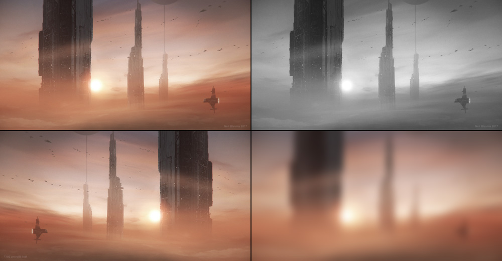
Photoshop Tests: Do your
photoshop tests: Greyscale, Flip, and Squint / Zoom.
Place a Hue/Saturation layer on the top of your image, and set
saturation to 0. Even without color does the image still read? I not,
you may need to change some things. Our visual system works best with
darks and lights, so an image that works in greyscale will work almost
no matter what colors you choose.
Flip the image horizontally (and
sometimes vertically). Does the image still feel balanced? If not, may
be time to move an element.
Squint at your image, or zoom out
really far so the image is less than 2cm on your screen. If the image
still looks interesting that small or that blurry, then you likely have
a good image.
4) Form Check
Check the shapes and forms in your painting.
Interesting Shape Language:
Is the shape language of your designs unique and interesting? If
your spaceship say is a simple sphere, maybe add some parts of the
sphere cut out, or is the sphere made up of smaller shapes that when
combined give the impression of a sphere?
Consistent Shape Language:
Are all the shapes in the image part of the same Vocabulary?
Like if your
painting is two warring armies, is it obvious through shape whether an
individual soldier goes with one army of the other?
Areas Of Visual Detail And
Visual Rest: Are there areas of Complex
Details? Of No Details?
If there is more
contrast between the parts of the minutiae than there is between the
parts of the larger design, the shape of the larger design will be lost.
One thing many artist (including myself) tend to do when painting is
forget to make the materials really read like the material they're
supposed to be, or make too many objects the same material. Material
variety is important to a successful painting.
Differentiate The Materials:
Make sure the different materials in
your image look
different. For example, the highlight on a piece of leather is going to
look very different from a highlight on a piece of chrome. So make sure
that your different materials look like the different materials you're
trying to make.
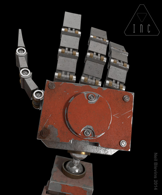
Have More Than One Material:
So for example, if making a robot,
instead of using all the same grey metal on everything, make some
bright
shiny metal, dark dull metal, painted metal, some golden colored metal,
some rust. And maybe find some spots for non metal objects to add
variety.
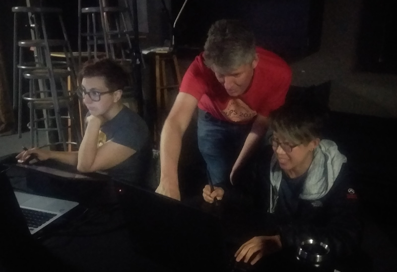
6) Ask Someone's Opinion
Fresh eyes are important, and no eyes are fresher than getting the
opinion of someone we trust that has a good eye. But that said,
remember, if
someone says to change something, ask WHY they want it
changed, rather than just changing it. Everyone has a different way of
solving a visual problem, and part of what you unique as an artist is
you problem solve in your own special way. But if you know WHY
something
should be fixed, you might be able to fix it in a way that's more your
own style. As an example, say someone says "remove that car", but you
love that car, and you feel you need a car in the painting to show some
story point. Ask why they want the car removed. They may say because
it's so bright that your eye jumps to it instead of looking at the
focal
point of the image. And so you can fix it by making the car less
bright. Now you've fixed the real problem, but kept the car that was
important for other reasons.
7) Compare To Earlier Iterations
I tend to save iterations of a painting along the way, and sometimes I
get so focused on the details of my final painting that I'll paint over
some aspect of the earlier painting that was actually really cool. So I
tend to compare my final painting to my sketch, and see if all of the
elements that made the sketch so cool still exist in the final
painting. Or maybe the building being 1cm over to the left in iteration
5 looks better than my final painting. And so I am convinced to move
that building back.
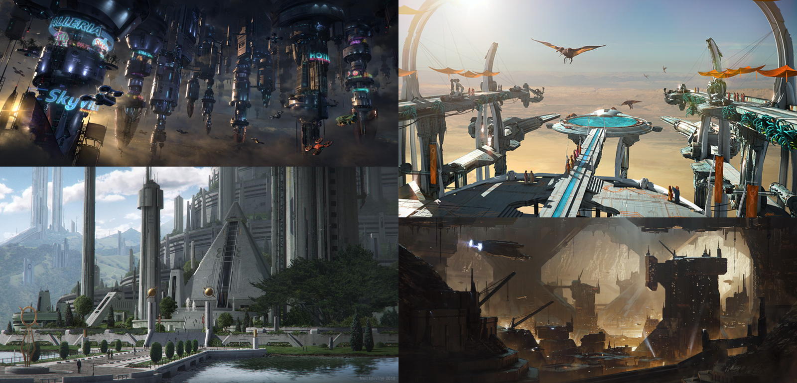
8) Compare To Other Work
The Ikea effect is "if you put effort into
something, you will automatically
think its better than it really is." So to break that spell, gather
some other artist's work and compare it to the painting you've just
made. This is NOT to give you ideas to copy. You don't want your image
to look like their image. Instead, you want to put your image alongside
other images you like, and see if it holds up. Obviously if you've
picked the work of your heroes, you may still feel your work doesn't
look as good. This shouldn't frustrate you. Comparing your images may
reveal smaller truths. Like maybe compared
to the other work you've chosen to compare it to, you suddenly realize
your work is far too monochrome. And you'll be inspired to add more
color to you image. Or your work isn't as detailed. And so you go back
and add some
extra detail. It's important to inject a little truth into how good
your image looks, but take that truth and don't get frustrated by it,
use it as a springboard to improve your own results.
Art by Andy Proctor / Chris Stoski / Neil Blevins / Ken Fairclough
9) Leave Image
Stop working on the image and
come back to it a few days later with fresh eyes. After working on a
painting for say 20 hours, I am tired and want the image to be done.
And so I'm more likely to want to declare it done because I don't want
to work on it anymore. But if I stay away for a few days or go on
vacation (note, this
only works for personal pieces or pieces for clients where the deadline
isn't tomorrow), I can come back to the painting and see what needs
to be fixed, and have the energy to make those changes.
Go On Vacation!
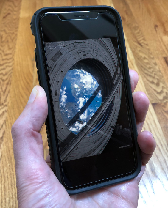
10) Try On Different Screens
Look at the image
on as many different computer setups and screens as
possible.
Desktop computers, ipads, iphones, etc. This happens a lot, I stare at
an image on my cintiq for close to 20 hours painting, I then put it on
twitter, look at it on my phone, and I instantly see the major
compositional issue with the image, all because I've switched to a new
screen. Then I have to take the image down and fix it. So more recently
I have exported a "finished" image to view it on my iphone, and that
lets me catch the issues before I actually post it for the world to see.
Conclusion
Hopefully this checklist helps the next time you're ready to call an
image done. I have my own version of this checklist that's skewed a
little more towards the things I tend to forget. So let this list be a
starting spot. If there's things you know you're particularly weak at,
make sure to emphasize them in your own personal tweak checklist. Your
artwork will be better for doing that one last final check!