You have two choices with this lesson, watch me discuss the issue in
the video below, or read the full text.
In my video lesson "A Study In
Greens", I discussed how as a young child, you are quickly directed
away from painting what you see or what you feel to painting what you
know. The grass is green, and here's a jar of paint that says green, so
use this paint to achieve success. But the truth is that real grass can
be any one of thousands of variations of green, and even some colors
that aren't green at all.
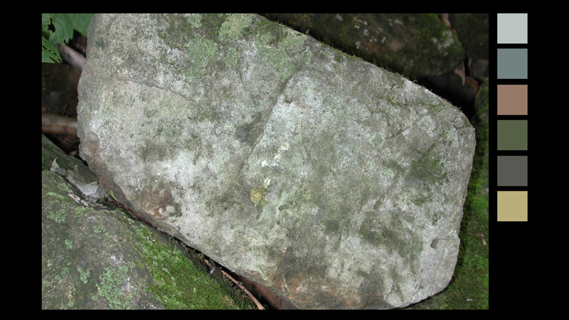
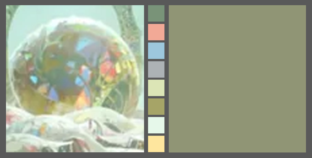
Here's another example. This rock if described would be described as
grey. But when using the color picker, you can see different parts of
the rock actually contains almost every color under the rainbow.
So to replicate this in our art, we can of course copy all of these
colors in exactly the placement and proportion of our photo reference.
Or we can use some shortcuts that can lead to the same richness of
color but are more expressive. This is frequently called "Accidental
Colors", or I've also seen it called "Color Vibration". But don't let
the term accidental fool you, many times this color variety is very
intentional.
The technique is to paint primarily with hues and values that represent
the overall color of the object, but then to inject small, almost
random colors into the painting, usually from the other side of the
color wheel.
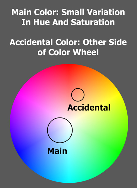
And this causes that color complexity that I described without muddling your primary color palette. This can be done in either 2d or 3d, and in fact was something I used all the time when texturing 3d props during my time at Pixar.
This technique was used by the Impressionists in the 19th century,
you can read more about them here: Impressionism.
2D Accidental Colors
So when painting something in 2d like this rock
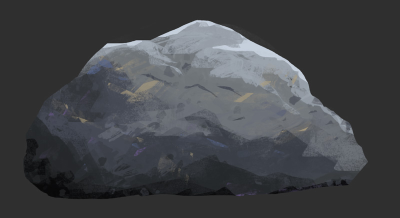
You use the main color of the rock, varying the value and hue
slightly to add a little bit of color complexity, and then add every
once in awhile some small touches of color from the opposite side of
the color wheel. This adds more energy, variety and life to the rock,
making it feel more real without necessarily going for realism. You can
even add these accidental colors on a separate layer so you have
complete control over how strong the effects is.
Here's another example from Bill Cone, who was a production Designer at
Pixar.
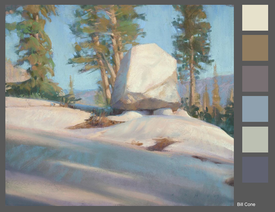
This is using traditional pastels, and lets discuss the rock in the
center of the image. It's a whitish grey rock, but has so many
accidental colors. Now I don't know if he meant to do this, or if it's
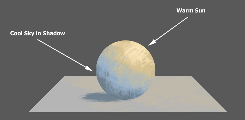
just a side effect of his process, after all, some of these colors are
because he's using cool and warm light on the rock...
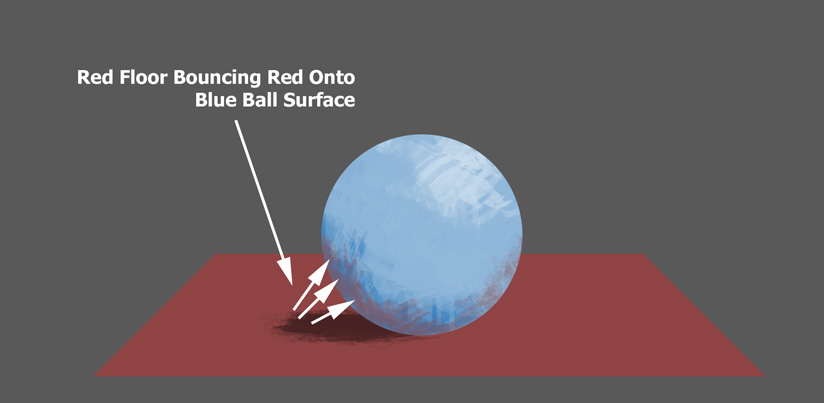
and some are hints of light bouncing from other colored surfaces.
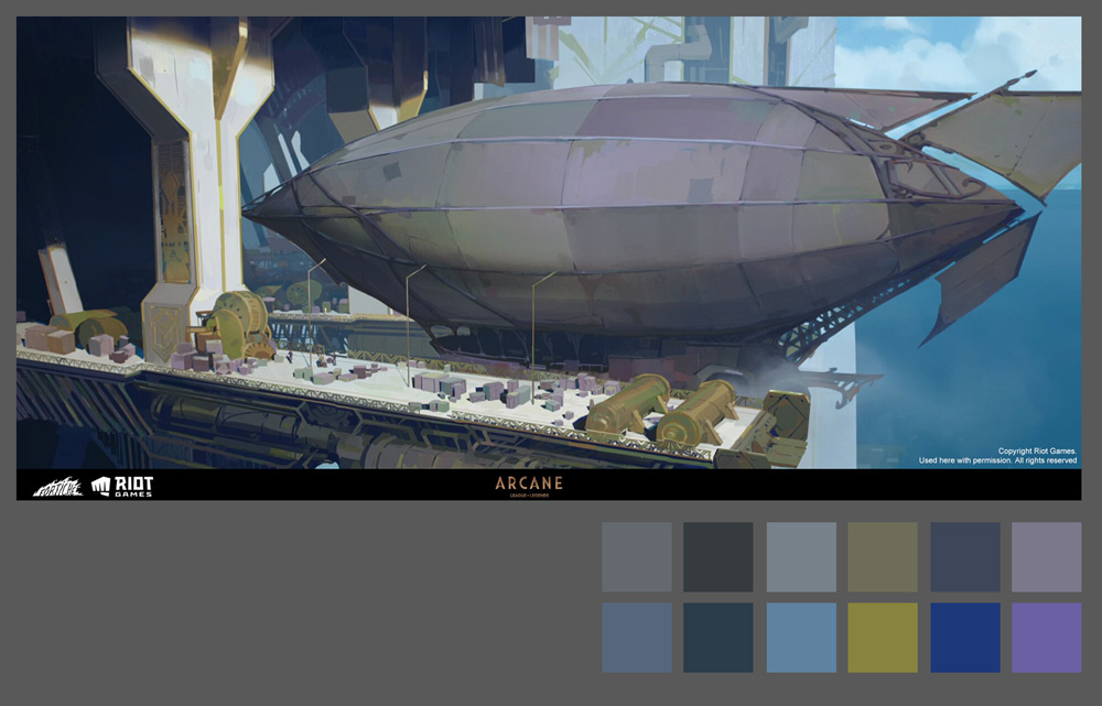
As well as the color picked color, I also included the same color
but with their saturation increased. Notice the wide variety of hues in
the blimp.
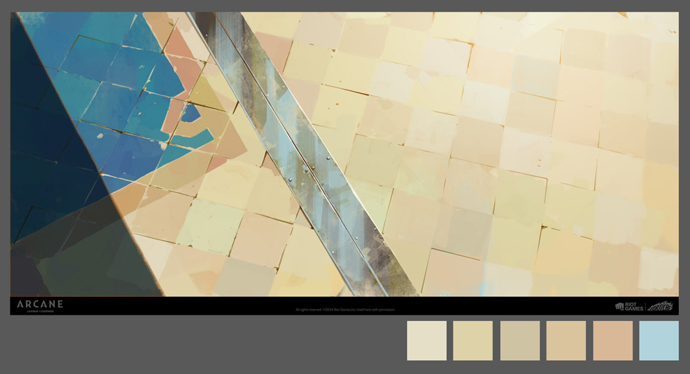
Take a look at this floor. Mostly tiles of orange and yellowish
colors, and every once in a while a touch of blue, maybe to suggest a
bright blue sky above.
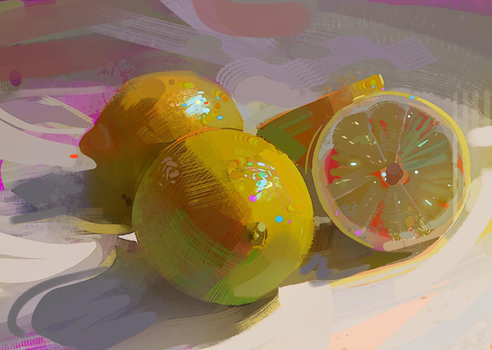
Here's a tour de force in accidental colors.
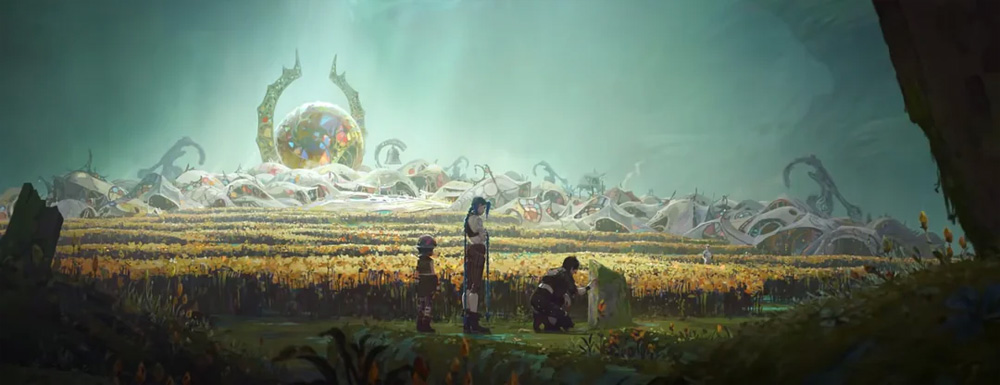
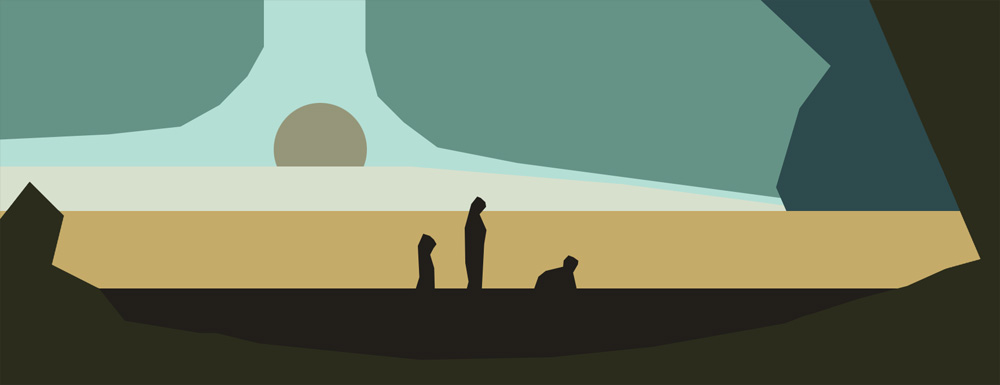
If you simplify this image into its base colors, you'd get something
like this...
3D Accidental Colors
Now lets look at a 3d example. If you're painting the texture maps in 2d or 3d by hand, and then applying the textures to your 3d object using UVs, then you can follow the same 2d technique as outlined before. But a lot of texturing I do in 3d tends to be more procedural, instead of painting details directly on the surface with UVs, I am using projected textures using triplanar maps to add the initial materials to my surface. In this case, I use textures like this one as a triplanar map.
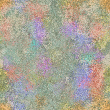
I take this map into my 3d package of choice, use it inside a Triplanar Map,
And mix it with the main color of the object, using either Multiply or
Overlay or Hue mode, and then reduce the opacity so it tints the colors
slightly, not radically.
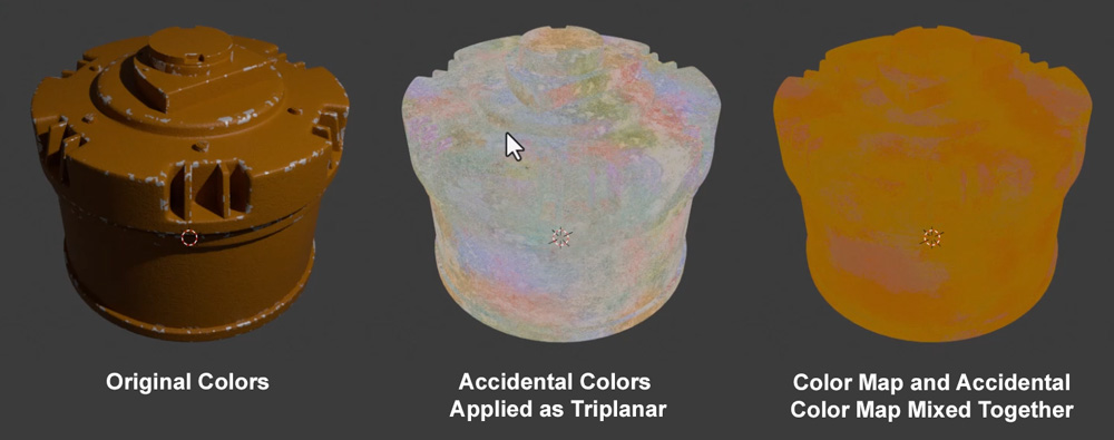
And here's the final result, without and with. You can see the
subtle color shifts that happen.

Conclusion
A few final notes...
So give this technique a try next time you're painting something. Of
course, you should use more of less of this technique depending on the
style you're going for.
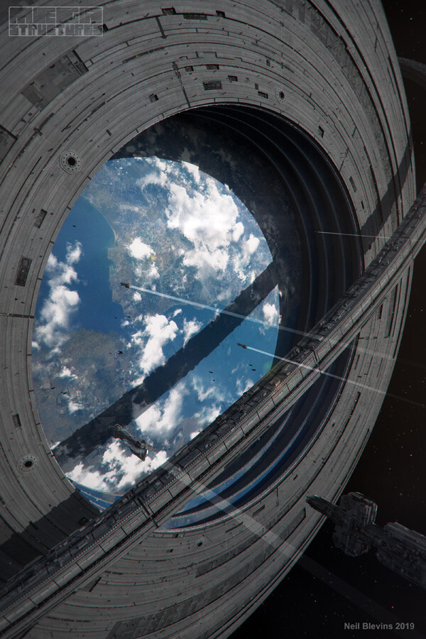
For example, my Megastructure project was supposed to be more
scientific and sterile,
but for the Space Baroque project I wanted to go for something more
lively, and you can see how adding a little extra color in the right
places to your imagery can give it a lot more life without destroying
your color palette consistency.