Clumping and Grouping
By Neil Blevins
Created On: Sept 3rd 2012
Updated On: Dec 3rd 2024
Software: None
Go here
to read this tutorial in Russian.
This tutorial discusses a number of things you should consider when
clumping details together (also called "Grouping"). Clumping can take
an otherwise boring image and make it more dynamic. Clumping happens a
lot in nature, with plants, rocks, mountain ranges, etc.
You have two choices with this lesson, watch me discuss the issue in
the video below, or read the full text.
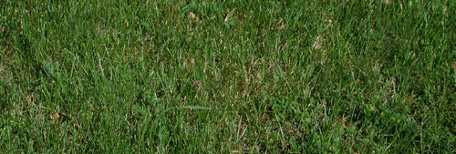
Does the grass look more visually interesting all uniform like this?

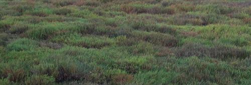
Or all clumped together like this?

Hopefully, you like the 2nd picture more.
Clumping can also be used for
mechanical things, placing a number of similar items together in an
aesthetically pleasing fashion, even stuff like placement of spaceships
in a space scene.
Before reading this tutorial, you may
want to check out these other three tutorials that discuss
similar compositional issues: Primary,
Secondary and Tertiary Shapes, Contrasts
In Composition, and Areas
Of
Visual Detail, Areas Of Visual Rest.
What Is Clumping?
When the eye sees objects that are related to
each other, like the objects are near each other, they're all of a
similar size, they're all of a similar color, etc, the eye tends to
lump all of those objects into a single shape or group or clump.
Clumping or grouping helps organize an image for the viewer, and tends
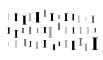
to be more aesthetically pleasing. Like this example...

This image has all the object almost the same distance away from each
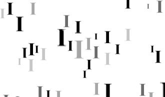
other, whereas this image...

has the objects clumped together. When the eye sees this image, it
tends
to create single object of the clumps, grouping multiple objects into a
single larger object.
Like for example this image...

If you ask someone what this is, they'll probably say "It's a square
made up of little lines". They won't just say "It's a bunch of lines".
Because their vision system groups together the lines into one object,
and then compares that object with known objects to give its answer.
Our visual system enjoys grouping objects together into larger more
manageable objects, and so clumping can make an image more brain
friendly, hence, makes it more aesthetically pleasing. This is due to
the "fight or flight" portion of our development, our visual system has
become good at taking various visual clues and grouping them together
so our brain can easily recognize what the object is. This has helped
us evade predators in the distant past, for example, if there's a tiger
hiding in the grass, ready to eat us, our visual system will take the
little portions of the tiger it can see, group them together, and
figure out it's a tiger, so we can get the heck out of there before its
too late. So our visual system needed to become good at grouping things
in order to keep us alive. Now we can use the same tricks to help us
make more enjoyable artwork :)
Clumping Tips And Tricks
Some here's a number of tips you should consider when grouping details.
Remember, there are always times when these rules should be broken, but
following some of these rules will tend to lead to better compositions.
1) Avoid Repetition (Number Of
Elements): If you have a clump of 2 objects, there shouldn't be
another
clump of 2 nearby (this is called avoiding "Twining", since the
duplicate clumps look like twins).

2) Avoid Repetition (Size):
Don't have two objects in a clump that are the same
size, or two clumps that are the same size, they will compete for each
other.


3) Avoid Repetition (Spacing):
There should be an irregular distribution of
details, make sure you have uneven spaces between objects in your
clump, and between the clumps themselves.


4) Odd Number Of Elements:
Frequently, clumps look better when they contain 3, 5, 7, etc elements,
Clumps with 2, 4, 6 elements tend to not feel as balanced. This
principal is even found in Bonsai plant grouping, this is from the
Bonsai Empire Website:
"Although Bonsai are often planted solitary, trees in nature are more
commonly found in groups. Creating a Bonsai forest (or group planting)
requires an odd number of trees (that is, in case only a few trees are
used, to provide asymmetry), usually belonging to the same botanical
family."

5) Overlapping Objects:
provides visual interest by creating depth.

6) Small, Medium, Large: Each
clump should have small, medium and large
objects in it.

7) Small Outside, Big Inside:
smaller details should generally be on the edge of the clump,
larger details in the middle of the clump

8) Clumping Using Color or Value:
As well as just being near each other, 2 or more objects can form a
clump if they have the same color, or the same brightness (like using
lighting to make clumps). It helps simplify busy backgrounds.

9) The Whole Is Important: the
viewer should not be looking at a single item that makes up the clump,
they should be seeing the whole made up of all the items.

10) Standout Items: Even
though the whole is most important, don't forget to add a standout item
or two inside your clumps to keep things varied, nothing so
overpowering as to destroy the group, just a little enhancement.

An Example
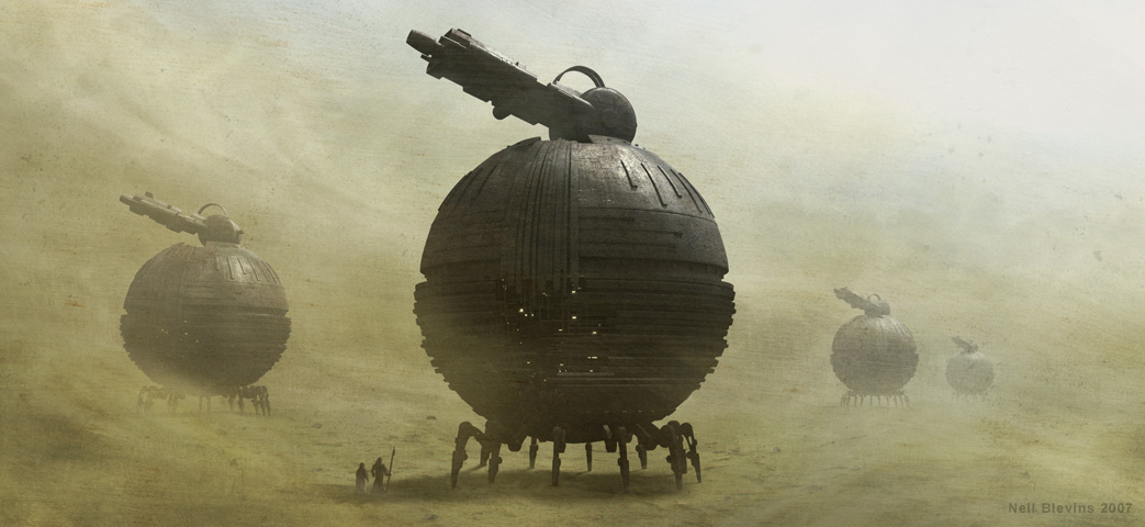
Here's a quick example of some of these principals, my
image Planetary Defense from 2007.

Here's a few of the principals:
- None of the cannons are the same size as each other (tip 2).
- The spacing between each cannon is slightly different (tip 3).
- While there are 4 objects in the clump of cannons, the 4th one is
almost completely obscured by the dust, so you have 3 standout elements
in the clump (tip 4).
- Small, Medium and large cannons are present (tip 6)
- The largest cannon is on the inside, and the smallest on the
outside (tip 7)
- The background cannons are clumped together because they have a
generally similar value thanks to the dust, making the closest cannon
standout as the focal point (tip 8)
- To avoid monotony of 4 identical cannons, I rotated each slightly
differently, and added the people near the closest cannon to
give it a
little something different to offer (tip 10).
And here's a few ways this painting could be improved:
- Add a 5th tiny cannon in the background, maybe between the 1st
and 2nd cannon from the left (tip 4)
- Maybe have a cannon overlap another (tip 5)
- Rotate the cannons a little more randomly to avoid twinning (tip
10)
Again, these tips are not hard and fast rules, plenty of spectacular
images violate many of these rules, but using a few of them in your
composition can help make it stronger.
This site is ©2026 by Neil Blevins, All rights
are reserved.
To see hundreds of other tutorials similar to this one, visit the
Neil Blevins Education Site
